How to build content-friendly layouts in SwiftUI
 @zntfdr
In Adaptive SwiftUI views, we've covered many approaches on how to make our layouts responsive to different external factors such as size classes, dynamic type, and more.
While these are awesome, they don't consider another important factor: the actual content size.
Let's address this!
The UIKit way
WWDC20 session Build localization-friendly layouts using Xcode covers precisely how to do so in UIKit:
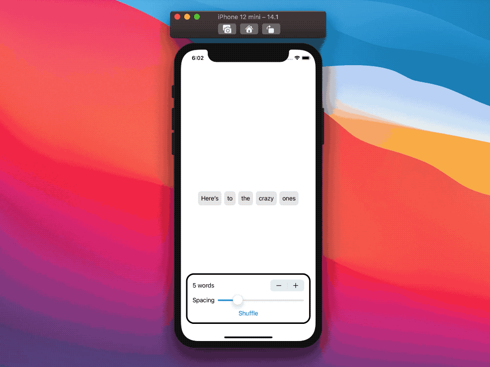
the session introduces ReadjustingStackView, a horizontal stack that turns vertical when the available horizontal space is less than the content needs. Here's the session demo project:
 |  |
Left: a standard horizontal
UIStackView. Right: the newReadjustingStackView.
And this is ReadjustingStackView's definition:
class ReadjustingStackView: UIStackView {

  /// To know the size of our margins without hardcoding them, we have an
  /// outlet to a leading space constraint to read the constant value.
  @IBOutlet var leadingConstraint: NSLayoutConstraint!

  required init(coder: NSCoder) {
    super.init(coder: coder)
    // We want to recalculate our orientation whenever the dynamic type settings
    // on the device change.
    NotificationCenter.default.addObserver(
      self,
      selector: #selector(adjustOrientation),
      name: UIContentSizeCategory.didChangeNotification,
      object: nil
    )
  }

  /// This takes care of recalculating our orientation whenever our content or
  /// layout changes (such as due to device rotation, addition of more buttons
  /// to the stack view, etc).
  override func layoutSubviews() {
    adjustOrientation()
  }

  @objc
  func adjustOrientation() {
    // Always attempt to fit everything horizontally first
    axis = .horizontal
    alignment = .firstBaseline

    let desiredStackViewWidth = systemLayoutSizeFitting(
      UIView.layoutFittingCompressedSize
    ).width

    if let parent = superview {
      let availableWidth = parent.bounds.inset(by: parent.safeAreaInsets).width - (leadingConstraint.constant * 2.0)
      if desiredStackViewWidth > availableWidth {
        axis = .vertical
        alignment = .fill
      }
    }
  }
}
The magic happens in adjustOrientation(), where we do the following:
- compute the horizontal space our content would take if laid out horizontally
- compute the actual available space
- compare the two values above, and decide the final orientation
Thanks to Apple, we're done in the UIKit world: ReadjustingStackView works as advertised, and its implementation is straightforward. Let's move to SwiftUI next.
The SwiftUI way
The aforementioned WWDC20 session doesn't provide a solution in SwiftUI; however, we can take the same steps as in ReadjustingStackView's adjustOrientation() and apply them here.
For simplicity's sake, we're going to change the order of the steps slightly:
- compute the horizontal space available
- compute the content total horizontal space
- decide the layout orientation
1. Compute the horizontal space available
If this sounds strangely familiar, it's because we covered how to do so in the first step of Flexible layouts in SwiftUI, which was based on Sharing layout information in SwiftUI.
Without repeating the same content here, please refer to those two articles.
The outcome is a new view, which we will conveniently call ReadjustingStackView, with knowledge on how much horizontal space is available (stored in its availableWidth property):
struct ReadjustingStackView: View {
  @State private var availableWidth: CGFloat = 0

  var body: some View {
    ZStack {
      Color.clear
        .frame(height: 1)
        .readSize { size in
          availableWidth = size.width
        }

      // Rest of our implementation
    }
  }
}
We can now move to our second step.
2. Compute the content total horizontal space
This step is solved by collecting the size of all elements in our content:
this is equivalent to step 2 of Flexible layouts in SwiftUI, which bring us to the following outcome:
struct ReadjustingStackView<Data: RandomAccessCollection, Content: View>: View where Data.Element: Hashable {
  let data: Data
  let content: (Data.Element) -> Content
  @State private var elementsSize: [Data.Element: CGSize] = [:]

  // ...

  var body: some View {
    ZStack {
      // ...

      ForEach(data, id: \.self) { element in
        content(element)
          .fixedSize()
          .readSize { size in
            elementsSize[element] = size
          }
      }
    }
  }
}
With this, we've completed our second step! It's fantastic when we can apply the knowledge that we already have.
3. Decide the final layout orientation
With both our availableWidth and elementsSize, it's time to implement the logic that compare the two and decide which axis our layout will take, a way to do so is the following:
func isHorizontal() -> Bool {
  let desiredStackViewWidth = data.reduce(into: 0) { totalWidth, element in
    let elementSize = elementsSize[element, default: CGSize(width: availableWidth, height: 1)]
    totalWidth += elementSize.width
  }

  return availableWidth > desiredStackViewWidth
}
isHorizontal tells us whether we should use a HStack or a VStack by computing the total horizontal width first, and then comparing it with our availableWidth.
With the orientation in our hands, all is left to do is the actual view declaration:
struct ReadjustingStackView<...>: View where ... {
  // ...

  var body: some View {
    ZStack {
      // ...

      if isHorizontal() {
        HStack(spacing: spacing) {
          elementsViews
        }
      } else {
        VStack(spacing: spacing) {
          elementsViews
        }
      }
    }
  }

  var elementsViews: some View {
    ForEach(data, id: \.self) { element in
      content(element)
        .fixedSize()
        .readSize { size in
          elementsSize[element] = size
        }
    }
  }

  // ...
}
We extract elementsViews from the body declaration just to avoid having to repeat the same code twice.
Switching between the two layouts is effectively as if we were drawing those elements from scratch (therefore, all events such as
onAppearwill be triggered when switching).
With this, we’re done! The final project also considers the spacing between elements in the stack (left out from the article for simplicity's sake):
Conclusions
While our SwiftUI solution might not be as intuitive and as concise as the UIKit one, we must also keep in mind that we're comparing a 10+ years old framework with a 1.5 years old one:
I'm sure more SwiftUI view extensions are coming, making things such as getting an intrinsic view size easier or getting a proposed size possible.
With that being said, I see the current limitations as opportunities: the more we struggle to find ways to implement something today, the more we learn about how SwiftUI works.
What challenges have you faced with SwiftUI? Did you implement something tricky? Please feel free to reach me out, I'd love to know!
Thank you for reading, and stay tuned for more articles!