How To Adopt Dark Mode In Your iOS App 🌙
 @zntfdr
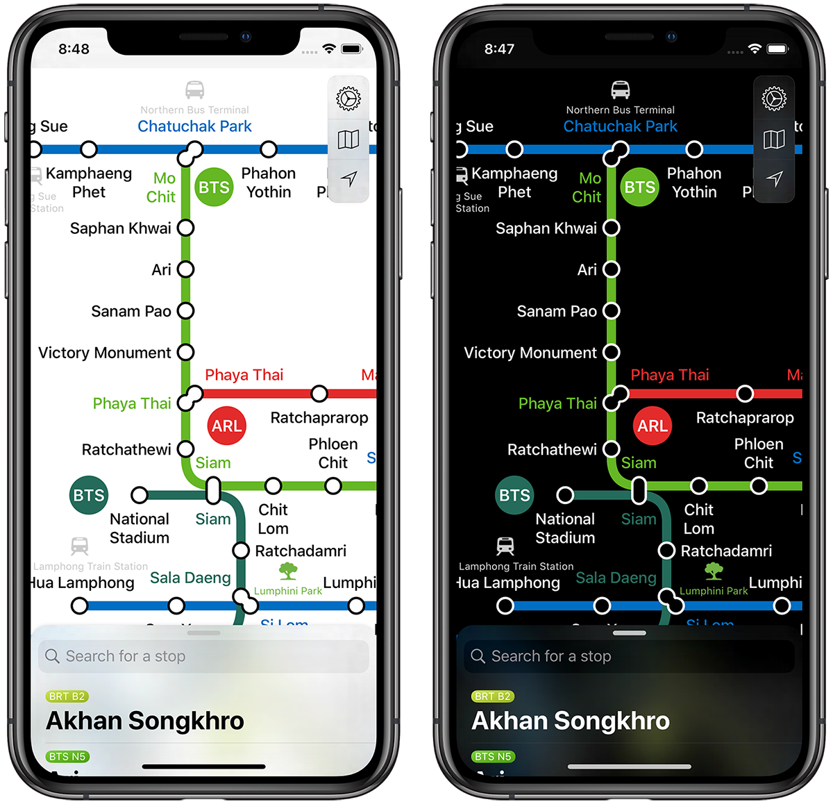
My metro app, both in dark and light mode.
This article is also available in Japanese 🇯🇵.
Rejoice! iOS 13 comes with Dark Mode! 🤩
I've just finished adopting the new appearance in my own apps, and I've learned a few things along the way: let’s see how you can do it, too!
Two Steps Back First
Before diving in, we need to be aware of a few things:
In order to give our users the best experience, it is really important that you don’t skip this part. Ready? Let’s go!
Requirements
For your app to support Dark Mode, it must: 1. Have been built and released with Xcode 11
If you use Xcode 10 (or earlier), the app will always display its normal appearance, even on devices with Dark Mode enabled. 2. Run on an iOS 13 device
Only devices running iOS 13 (or later) support Dark Mode, previous versions of iOS will resort to the default appearance.
You cannot enforce Dark Mode on an older iOS over the default appearance (actually, you can, however it involves creating a lot of custom logic to do so, it’s not worth it).
⚠️ Here's another way to look at it: if your app has not been updated with Dark Mode support by the time iOS 13 launches, the app will always display its default appearance, regardless of the iOS system settings. If your users have enabled Dark Mode and your app doesn’t support it yet, your app will flash your users with that bright default interface! 🙈
Using Apple words: “You really don't want to be that one light appearance that's stuck in dark appearance”.
Your App Supports Dark Mode Already
This is both the cool and scary part:
Once the (two!) requirements above have been fulfilled, whenever Dark Mode is enabled, your UI will automatically switch appearance.
This is awesome, because it means that we get a lot of work done for free:
however, if we don’t make sure that our app looks good in dark mode, some of our UI will certainly look weird, probably with bright shiny colors, even in this new appearance. This would be a really bad experience for your users, read on to avoid this.
You Can Force One Appearance Over The Other
If you really wish to avoid adopting dark mode in your app, drop the “light mode” indefinitely in favor of dark mode, or simply postpone your dark mode adoption to another time, add a new key UIUserInterfaceStyle in your app info.plist and set its value to Light or Dark.
Another way to do so would be to keep shipping your app with Xcode 10 😆
Don’t Force One Appearance Over The Other
Using Apple words: “Only a small subset of apps really should be dark all the time, and those are media-centric or content-creation apps“. Unless you have a very good reason to offer just one interface appearance, make sure to always respect the system preference. It doesn’t matter how much you prefer one over the other.
Apple allows you to have an in-app setting where the user can choose which mode to use in your app, regardless of the system preference: again, unless your app has a very good reason to do so, the best experience is to respect the system mode. Don’t offer unnecessary, redundant settings.
Dark Mode Is Not The Only New Mode
This might have not hit the press as much as Dark Mode, however iOS has always had two modes: default and high contrast (you can enable this in any iOS device by going to Settings > Accessibility > Increase Contrast, tap also on General if you're still running iOS 12).
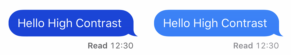
Left: iMessage in high contrast. Right: iMessage in the default appearance.
While you might be able to read with ease both left and right images, for someone else having some help (read: high contrast) would be great, for others it is the only way possible to read anything at all.
Now that we are aware of this, it’s clear that we have to take care of four appearances:
- Default
- Default High Contrast
- Dark Mode
- Dark Mode High Contrast
This is another reason why it is really important to stick with default UIKit (or SwiftUI) elements as much as possible: - if we do so, we get support for all of these appearances for free. - If we create our own colors and UI components, we must take care of each mode, element, and element state ourselves. This work grows exponentially.
Let’s Get Started!
If you’ve made it so far, congratulations! 🎉 From now on we will talk about what you can do, right now, to support the new interface appearances.
Step 1: Colors
At the end of the day, all our app do is throwing colors at the screen: getting colors right means having your app 99% ready for Dark Mode.
(Dynamic) System Colors
Until iOS 12, UIColor has offered us a few simple colors like .red, .yellow etcetera: you don’t want to use these colors any longer. These colors are static, which means that their tint never changes.
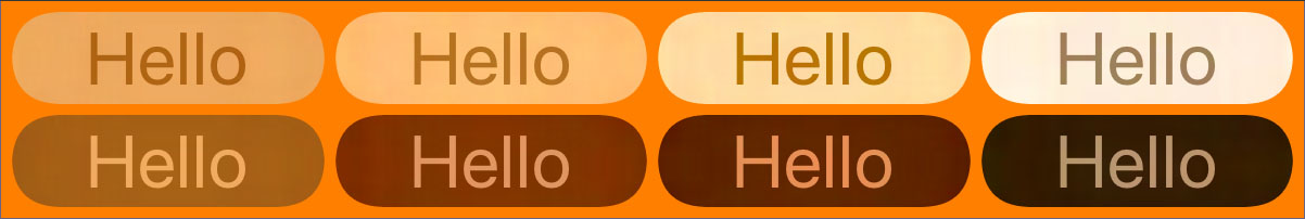
With iOS 13 and Xcode 11, Apple is introducing System Colors:

Top: System Colors in the default interface. Bottom: System Colors in dark mode.Xcode Playground here.
From left to right: .systemBlue, .systemGray, .systemGreen, .systemIndigo, .systemOrange, .systemPink, .systemPurple, .systemRed, .systemTeal, .systemYellow.
As you can see from the picture above, contrary to the old static colors, system colors are dynamic: their tint will adapt to the current system interface.
But those are not the only new colors! We also have a full range of grayscale colors, where the differente between dark and light appearance is even more obvious:

Top: System Colors Grayscale in the default interface. Bottom: System Colors Grayscale in dark mode.Xcode Playground here.
From left to right: .systemGray, .systemGray2, .systemGray3, .systemGray4, .systemGray5, .systemGray6.
All dynamic system colors also come with a special tint for high contrast. #a11y
By using these dynamic colors (e.g. UIColor.systemBlue instead of UIColor.blue), your interface will automatically pick the right tint for the current system preference, no further work required! 🎉
(Dynamic) Semantic Colors
Xcode 10 and earlier offered two colors named .lightText and .darkText.
The use of these is now discuraged, as they're static, and will not adapt to any interface. Instead, from Xcode 11 we a full new suite of semantic colors such as UIColor.label, UIColor.placeholderText, UIColor.systemBackground etc.
Instead of describing a shade, these colors names are based on their intended usage: most of the time you want to use these, as, like system colors, they’re dynamic.
Most importantly, semantic colors ensure that your app has a similar appearance to the rest of the system. By using these, your app will feel native, which is always the best experience for the user.
The more you use these dynamic colors, the faster you’ll properly adapt to Dark Mode.
Still supporting iOS 12 and earlier? Worry not: fellow developer Noah Gilmore shows you how to use the new colors while also maintaining backward compability in his brand new article "Backwards compatibility for iOS 13 system colors" 💯.
(Dynamic) Custom Colors: The Assets Catalog
This should always be your very last option to look at.
This is the only option that requires a lot of work, trial, and error, for both you and the design team:
let Apple do the work for you, they’ve invested an unbelievable amount of time from their super talented teams on this, trust and use their work, your app will be fine.
With the disclaimer out of the way, how do you define and use your own dynamic colors?
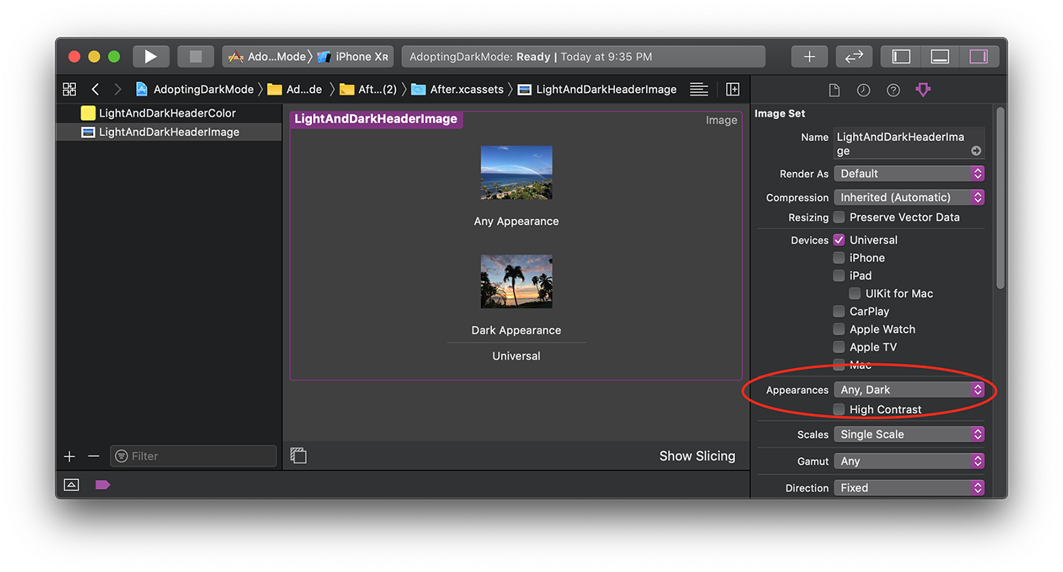
Since iOS 11 and Xcode 9 we can add colors into assets catalogs.
Now you can also define a dark variant for each color in there as well:
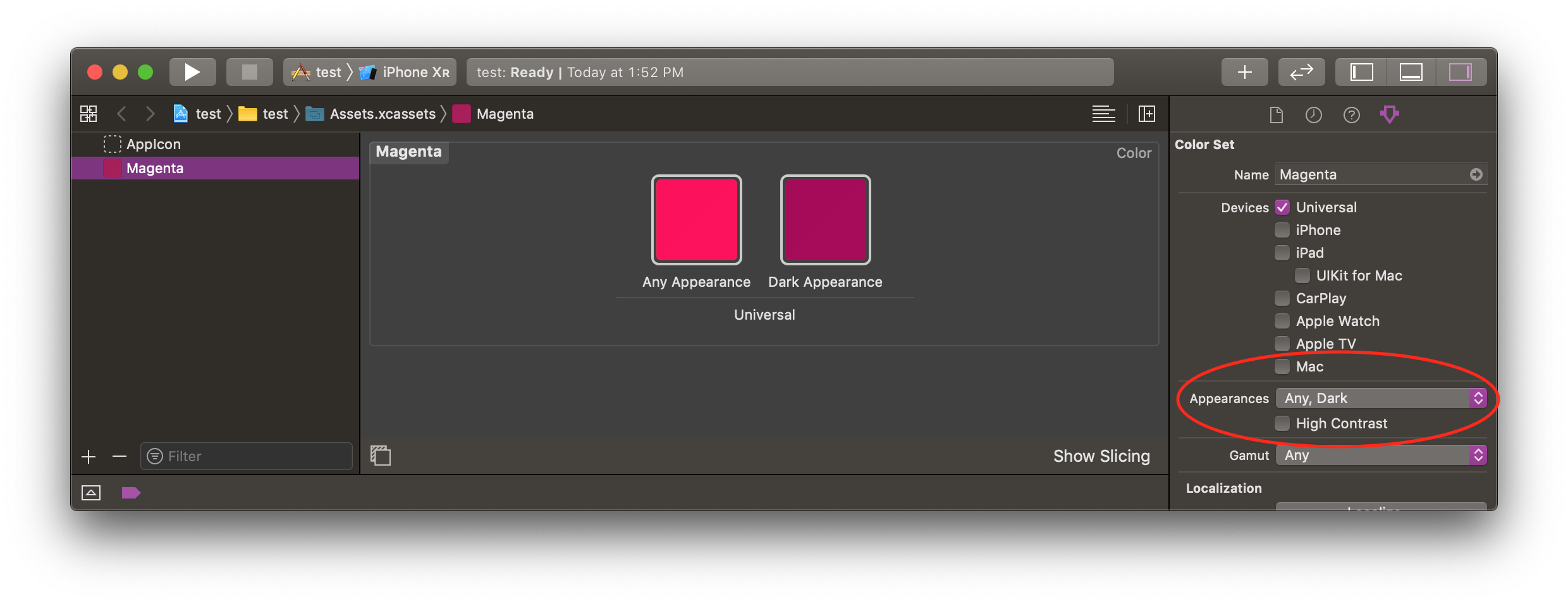
to do so, select a color in your assets catalog, open the Attribute Inspector (shortcut: ⌘⌥4), and set its appearance from None to Any, Dark:
Our own dynamic color!
At this point a new color box for the Dark appearance will appear: congratulations! You have just created your first dynamic color! Set each variant to its appropriate tint and you're good to go.
Don't forget to enable high contrast as well:
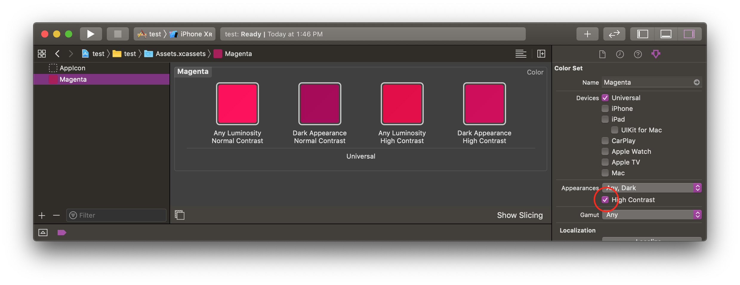
Four variants for the same color 😅
Again, I strongly suggest to use System and Semantic Colors as much as possible: in case of a button for example, using custom colors means defining one color for each button state: .normal, .highlighted, .focused, .selected, and .disabled.
This means requiring a different color for each state, for each appearance. If you do the math, one button now requires (5 states * 4 appearances =) 20, t-w-e-n-t-y, different tints! 😱
A heads-up in case you still want to go this route:for pressed button colors, using a darkened version of the default color doesn’t work any longer, as the effect is correct for light interfaces, however dark interfaces require a lighter color instead. 👍🏻
(Dynamic) Custom Colors In Code 🙈
If you’re still targeting iOS 10 (which doesn’t support colors declarations in the asset catalog) or don’t want or can’t use the options above, then the very last option available is to define colors in code:
let dynamicColor = UIColor { (traitCollection: UITraitCollection) -> UIColor in
    switch traitCollection.userInterfaceStyle {
    case
      .unspecified,
      .light: return .white
    case .dark: return .black
    }
}
Don’t do this, drop iOS 10 and use assets catalogs.
### Step 2: Images
Almost every app displays images and/or symbols in the UI. Unless those images display user content (like a profile picture), then it’s very good design to have one image variant for each mode. Let’s see how.
SF Symbols
Apple introduced SF Symbols at WWDC19. SF Symbols is a huge collection of glyphs (over 1500!) that are available for developers to use in their own apps.
Apple itself uses SF Symbols in every stock app like Reminders, News, Maps and more:
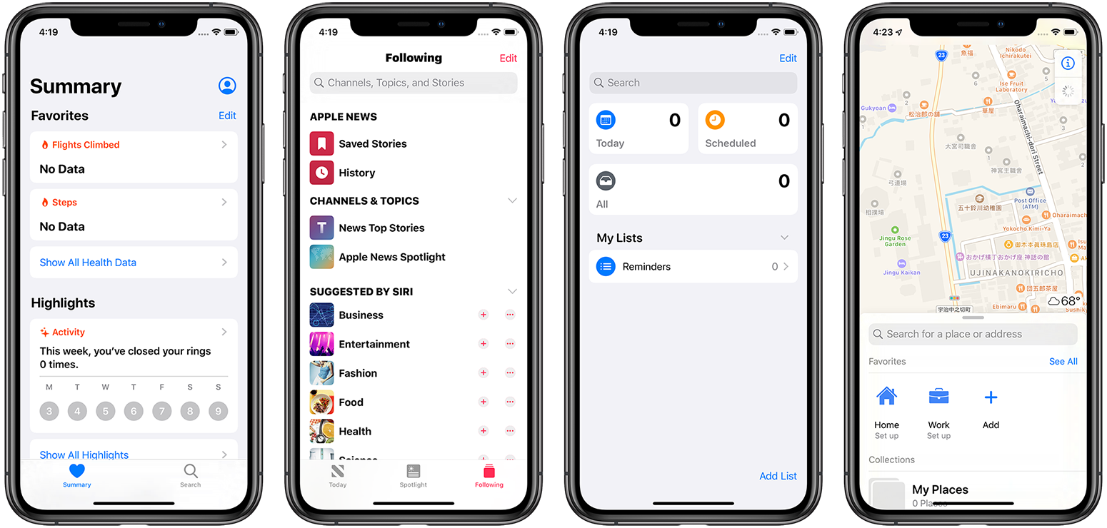
Some examples of iOS stock apps using SF Symbols
Some of the SF Symbols used in the screenshots above: can you spot them?
Not only Apple uses them, but it also encurage us to do so, too. In Apple Words:
"The system uses SF Symbols, which automatically look great in Dark Mode, and full-color images that are optimized for both light and dark appearances. Use SF Symbols wherever possible."
To recap, SF Symbols are a bunch of glyphs ready to be used in our apps:
wherever there's a glyph in your UI, see if you can replace it with one of these 1500+ glyphs that we get for free. Beside being vector images, which look perfect at any size, they also come built-in with the system: no need to package them up in our app! Yay for smaller app sizes!
If you're using storyboards, you can tell Xcode which symbol to use by typing the correct glyph name in the image name field (find the name in Apple's SF Symbols app available in Apple SF Symbols guideline).
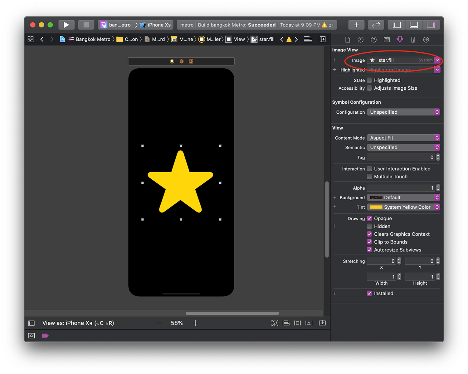
Note how the Attribute Inspector confirms that we're using a system symbol with the "System" callout
Alternatively, you can fetch any of them by using the new api UIImage(systemName:):
UIImage(systemName: "star.fill")
Cannot find something that you fancy? You can always export any of the available glyphs (as .svg) from the official SF Symbols app and change them to perfectly meet your needs 👍🏻
For more information about SF Symbols, watch the WWDC19 session 206: Introducing SF Symbols.
If you would like to access to the whole list of symbols from anywhere, fellow developer Noah Gilmore (again!) has your back with his new website sfsymbols.com, very handy if you're on the go 😎.
Since SF Symbols can be exported from the SF Symbols app, you can always package them in your app bundle: this way you can use the new symbols while still maintaining retrocompability.
Custom Template Images (Glyphs)
Like SF Symbols, template images are monocrome images that are defined in our Xcode assets catalog by selecting "render as" Template Image in the Attribute Inspector.
By using them, you get several advantages. To name one, you gain dark mode for free.
When using template images, remember to set the UIImageView tint to one of the dynamic colors described above:
let glyphImage = UIImage(named: "myGlyph")
let glyphImageView = UIImageView(image: glyphImage)
glyphImageView.tintColor = .systemYellow
Other Images
For all other kind of images that are not template images or symbols such as photos and more, we can follow the same steps as for custom colors: set their appearance to Any, Dark in the assets catalog and drop a new variant for each appearance.
Example stolen from Apple's sample app.
For more tips around images, use this Apple guide.
Note that adding a dark variant to any assets in the catalog doesn't break retrocompatibility: older iOS versions will always choose the asset tagged with
Any Appearance.
Step 3: UIVisualEffectViews - Semantic Materials
In case you need a quick catch-up with what you can do with these fantastic views, here’s a very clear article by Nikola Kirev.
Like for UIColors, until iOS 12 we had static UIBlurEffect.Styles (namely .dark, .light and .extraLight).
Xcode 11 has revamped these styles with brand new Semantic Materials:
we go from a delicate, semitransparent .systemUltraThinMaterial, to .systemThinMaterial, to .systemMaterial, until we arrive to a heavy .systemThickMaterial.
You can see them all here (grab the playground under the image):
Top: System Materials with vibrant label in the default interface. Bottom: System Materials with vibrant label in dark mode.Xcode Playground here.
Note how the text vibrancy dynamically adapts based on both the interface appearance and the UIVisualEffectView effect it sits on: we don't need to worry about readability, because iOS takes care of it for us 💯.
Step 4: Drawing Attributed Text
When drawing attributed text, if not specified, the .foregroundColor property is set to .black:
set it to a proper color instead (e.g. UIColor.label).
let textToDraw = "FiveStars.blog"
let attributes: [NSAttributedString.Key: AnyObject] =
  [.font: UIFont.preferredFont(forTextStyle: .title3),
   .foregroundColor: .label]
textToDraw.draw(at: CGPoint.zero, withAttributes: attributes)
Step 5: Dark Mode in CALayers
CALayers don’t understand dynamic colors.
When working with dynamic colors at this level, you can get the current UITraitCollection (which contains the active mode in .userInterfaceStyle) from the layer's view by calling view.traitCollection.
Once obtained, you can resolve any dynamic color for example with:
let resolvedColor = UIColor.label.resolvedColor(with: traitCollection)
layer.borderColor = resolvedColor.cgColor
In case where we need to resolve multiple colors, there's a UITraitCollection has a handy performAsCurrent() method that lets us do just that:
let manyDynamicColors = ...

traitCollection.performAsCurrent {
 for resolvedColor in manyDynamicColors {
   let resolvedCGColor = resolvedColor.cgColor
   ...
 }
}
Step 6: Overriding The System Appearance
Sometimes it make sense for a view to stick with one appearance, regardless of the system preference.
With iOS 13, UIView, UIViewController, and UIWindow have gained a new overrideUserInterfaceStyle property that lets us override the system appearance:
let view = UIView()
// this view will inherit the appearance of its superview

let darkView = UIView()
darkView.overrideUserInterfaceStyle = .dark
// this view (and its subviews) will always be in dark mode
overrideUserInterfaceStyle is an enum instance of type UIUserInterfaceStyle. This enum cases are either .dark, .light, or .unspecified, which is used to say that the view/viewController/window will inherit the interface from its superview/parentController/system.
Setting this property effects that specific view/viewController/window and anything that is "below" it.
By doing so, its view and all its sub views will adopt your preference instead of the system one.
In case you’d like a view to go back to listen to the system preference, set back the overrideUserInterfaceStyle property to .unspecified.
let viewWithCustomAppearance = UIView()
viewWithCustomAppearance.overrideUserInterfaceStyle = .dark
// this view (and its subviews) are now in dark mode

viewWithCustomAppearance.overrideUserInterfaceStyle = .unspecified
// this view (and its subviews) follow the appearance of this view superview
A Deeper Look
If your app completely relies on storyboards for the UI, then congratulations! You’re now set to fully support Dark Mode. Not all of us are this lucky, if you’re not among these people (🙋🏻♂️), read on.
Behind The Scenes: Draw Time
iOS picks the right tint/image of our dynamic colors/images at draw time: but when is “draw time” exactly?
As you know, our views can become invalid at some point in their lifetime:
maybe the user has rotated the screen, maybe a UIView needs to add a new element in the interface, etc.
From now on, our views will become invalid also every time the interface appearance changes.
You're always guaranteed to have iOS pick the right tint/material/image when you're inside any of the following methods:
UIView | UIViewController | UIPresentationController |
|---|---|---|
draw() | viewWillLayoutSubviews() | containerViewWillLayoutSubviews() |
layoutSubviews() | viewDidLayoutSubviews() | containerViewDidLayoutSubviews() |
traitCollectionDidChange() | traitCollectionDidChange() | traitCollectionDidChange() |
tintColorDidChange() |
Therefore, put your appearance-specific logic in any of them (make sure to not do unnecessary work though!).
If you're unfamiliar with these methods, I suggest you to have a look at this great article about Auto Layout life cycle.For even more insights, you can watch WWDC 2015 sessions 218 and 219, which are part 1 and 2 of "Mysteries of Auto Layout" (part 2 is the most important one).
A small reminder: these methods are exposed to developers to be overridden, not to be called.Call their complementary methods like
setNeedsUpdateConstraints(),setNeedsLayout(), etc. in order to trigger them.
Do not put appearance-specific code in init, viewDidLoad or other places:
these methods will be not be triggered again when/if the interface appearance changes.
Debugging Dark Mode
You're almost set to start adopting Dark Mode! There are just a couple of things that you should know first.
Storyboards
In scoreboards and .xib files, beside choosing the device and orientation to preview your screens in, you can now also toggle the interface preference between light and dark:
One of my storyboards, fully supporting Dark Mode.
I found it much faster to adopt dark mode by using this toggle rather than changing something and then testing it by building and running the app, I suggest you to do the same, especially if the screen you're working on is not easy to get into.
Simulator
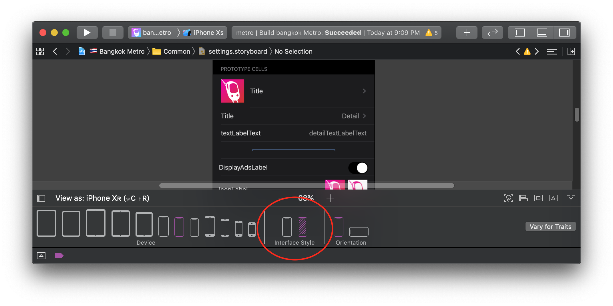
In Xcode 11 there’s a new button in the debugging toolbar: this button lets you access to an Environment Overrides popup which lets you, among other things, change font size and switch interface mode, you can even enable high contrast!
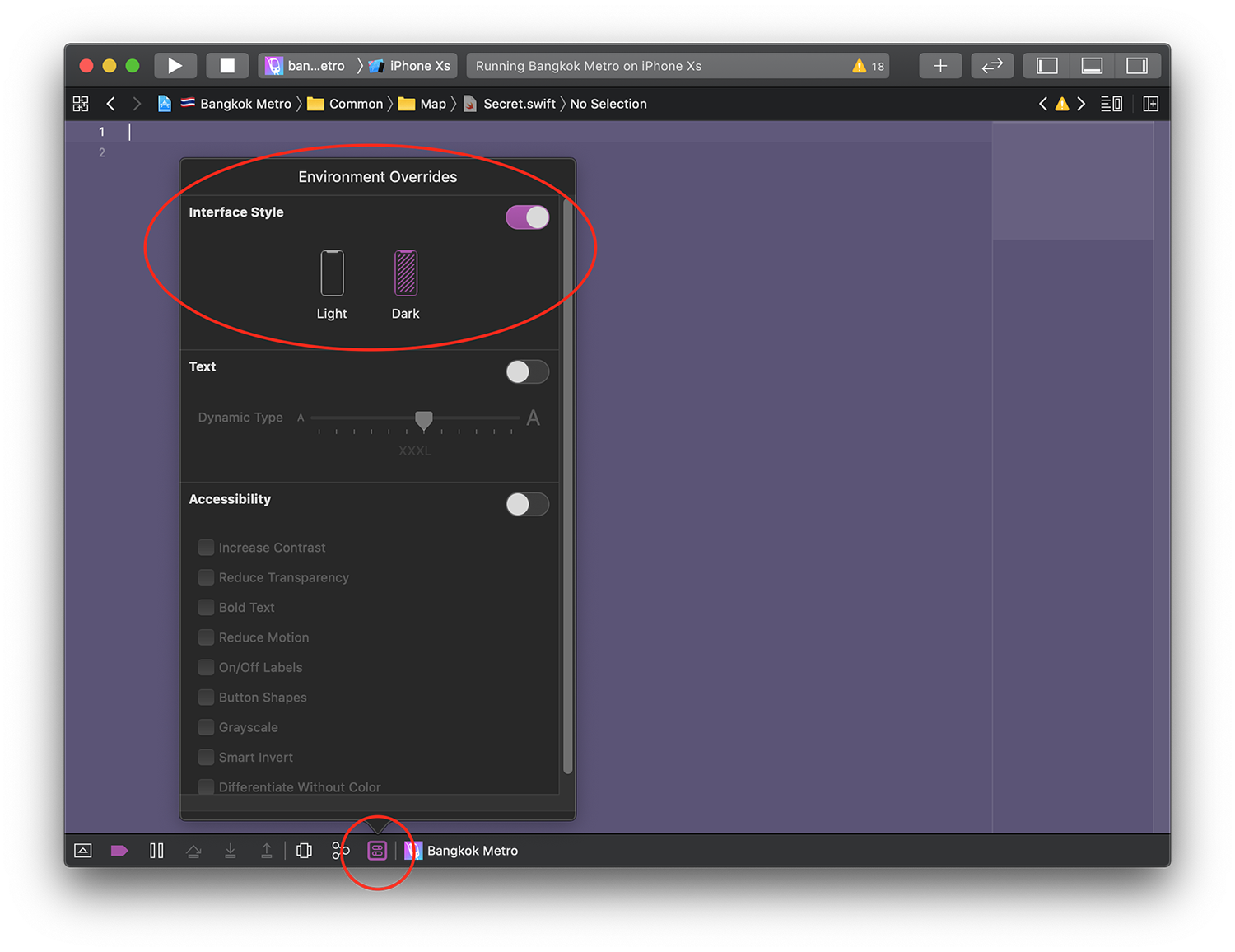
No need to use the Accessibility Inspector anymore, hurray!
Use it to test both interfaces on the simulator, this is the only way to change the interface appearance in there!
Obviously don't forget to test each screen on a real device before shipping 😉.
Where To start
Now that you're finally ready to adopt dark mode, here’s a roadmap for you to follow:
- Download and install Xcode 11 beta (duh!)
- Build and Run your app with dark mode enabled
- Fix the obvious "mistakes" spotted
- Add dark variants to all your assets
- Adapt Dark Mode one screen at a time:
- Start from the
.xibs files - Move to storyboards
- Move to code
- Repeat for all screens 6. Make sure to set the foreground key when drawing attributed text 7. Move all your appearance logic in the “Draw time” functions
- Start from the
Some heads up:
- don’t forget to test your app in light mode, too 😄
- don't forget the LaunchScreen storyboard!
Tips
Design System
If your app uses a Design System, then congratulations! Adopting Dark Mode will take you literally 5 minutes (assuming you've read this whole article).
If your app doesn't have one yet, now it's a great time to start building one.
In case you're unfamiliar with this concept, I suggest you to watch the awesome talk "Building a Mobile Design System" by fellow developer Kristina Fox from Try! Swift Tokyo (video, slides).
Assets Catalog: bid farewell to iOS 10
With iOS 12 adoption being over 85% as of June 2019, it's a no brainer to drop iOS 10 support. With that we can finally declare and use custom colors directly from the assets catalog, which will make your dark mode adoption quick and easy.
Use Storyboards and Xibs
Use your storyboards/xibs with the interface appearance toggle to preview each screen in both appearances, no need to build and run your app over and over to test every change.
Use SwiftUI
Anything built with SwiftUI automatically supports dark/light mode and their high contrast variants.
Dark Mode Resources
Apple has multiple great resources around adopting Dark Mode: - I suggest you to start from the Dark Mode section of Apple Human Interface Guidelines and choose where to go from there (plenty of links in that chapter!).
- another interesting resource from Apple is Supporting Dark Mode in Your Interface, which was written last year for macOS but still very valid for iOS.
Obviously there are also a few WWDC19 sessions that are a must watch:
It's also very good to watch the previous year sessions where we were first introduced to Dark Mode (in macOS):
Conclusions
Dark Mode has been in the works for years and we finally have it in our hands:
I'm using it everyday on my macs and I’m very excited to finally be able to use it on iOS, too.
What do you think? Will you use Dark Mode right away? Do you think adopting it in your apps is going to take a lot of effort?
I personally can’t wait to see it released! Feel free to reach me out on Twitter and share screenshots of your apps in Dark Mode! 🤩
Thank you for reading and stay tuned for more articles!