SwiftUI blend modes
 @zntfdr
When building view layouts, we often stack multiple views on top of each other.
The default behavior in SwiftUI, and most software, is for the top-most views to obscure/hide the bottom ones.
This makes sense and is reflected in real life: if we look at a stack of papers/documents from above, we can only see the top-most document, or, perhaps, the top-most few if the paper is very, very thin.
Going back to the virtual world, we can think about each view as a layer of pixels/points.
Each pixel has a set of properties such as color, saturation, opacity, etc. Instead of stacking these pixels on top of each other, we can blend them with rules based on their properties, obtaining different effects/outcomes.
SwiftUI offers twenty-one blending modes. Let's explore all of them!
How to apply blend modes
The blendMode(_:) view modifier is dedicated to blending views, there are mainly two ways we can use it:
- via a
ZStack:
ZStack {
  BottomView()
  TopView()
    .blendMode(...)
}
- via an
.overlay:
BottomView()
  .overlay {
    TopView()
      .blendMode(...)
  }
In both cases, we apply the modifier on the top view.
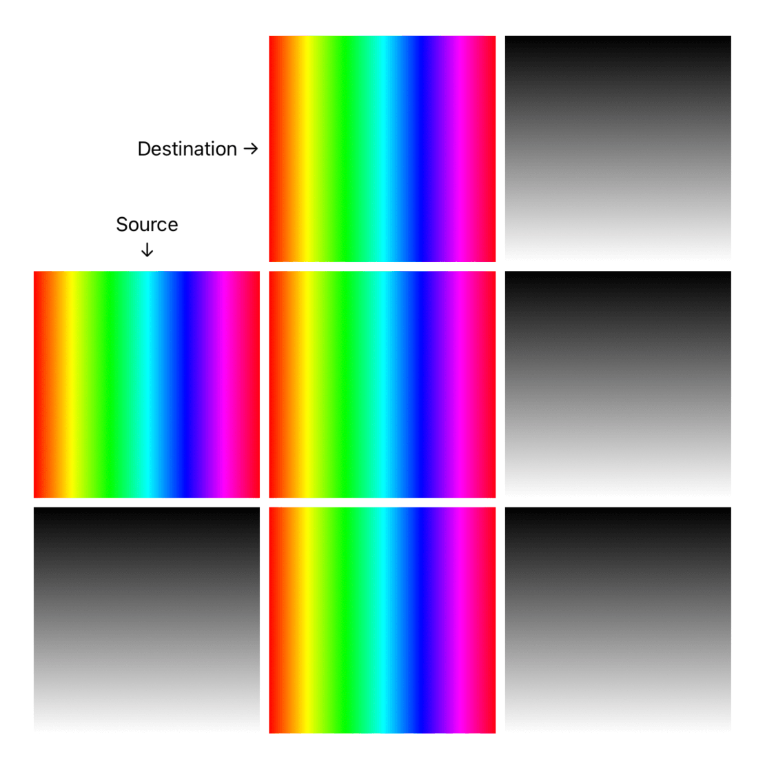
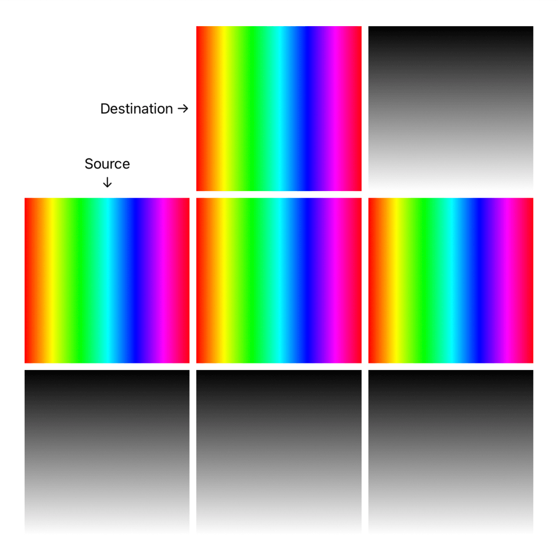
Blending destination and source
When it comes to blending, we have two main objects:
- the source, which is the view that comes with the blending effect (e.g.,
TopView().blendMode(...)) - the destination, which is everything underneath that view
When blending, based on the mode, we consider the properties of both source and destination.
Let's overview the effects.
Blending modes
📚 Sample code available here.
Different blending techniques use different pixel properties for their effect. We can group them into seven categories:
- Lighten
- Darken
- Contrast
- Component
- Compositing
- Invert
- Normal
The article's images might present some minor artifacts due to compression.
Lighten
The destination will get brighter by blending the hue of both source and destination. Pure black is the neutral color, while white is considered the brightest color.
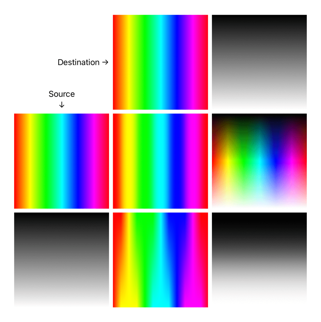
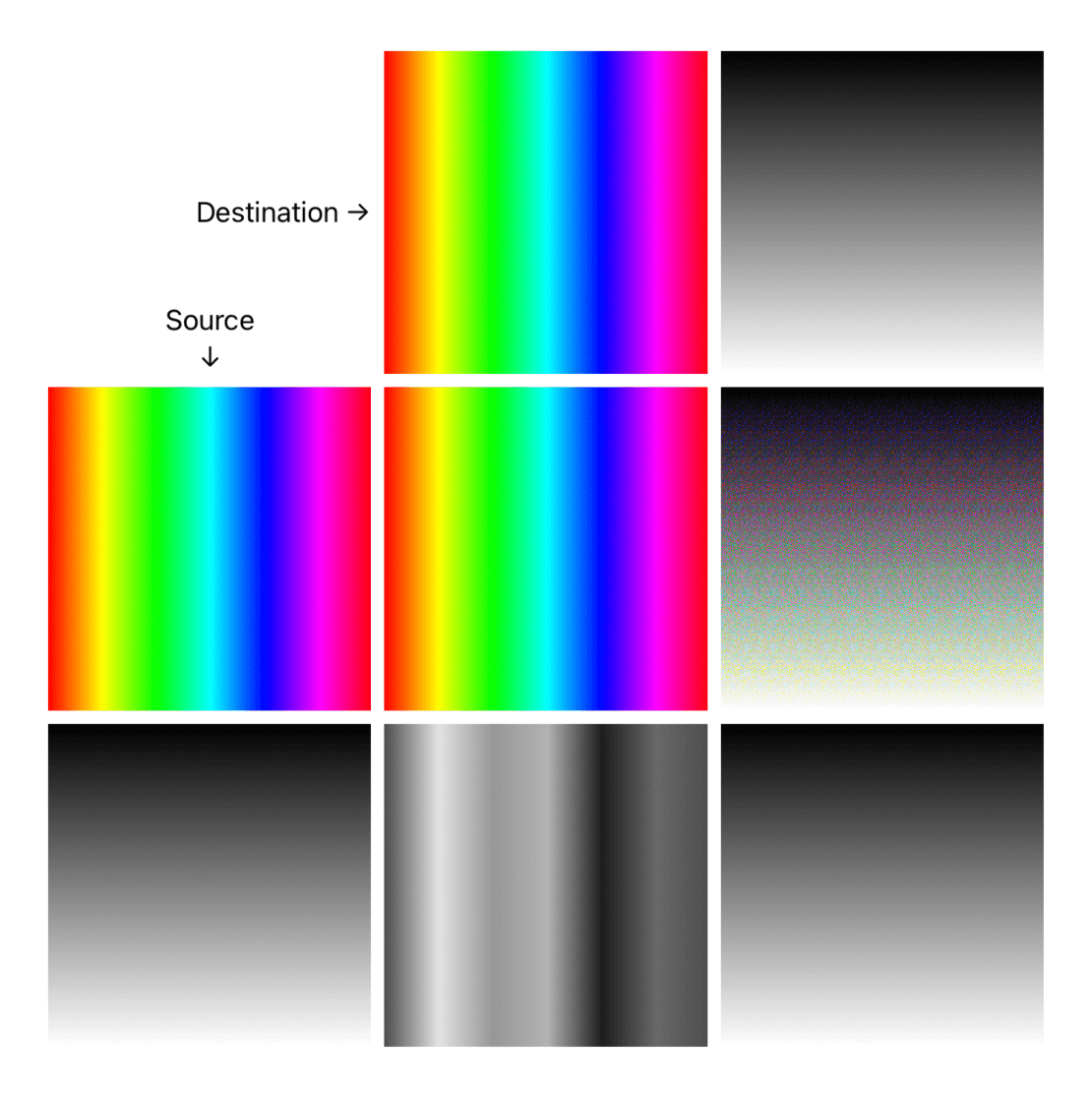
colorDodge- (opposite ofcolorBurn) decreases the contrast between the source and the destination. The brighter the source, the more its color affects the destination layer. Results in saturated midtones and bright highlights.
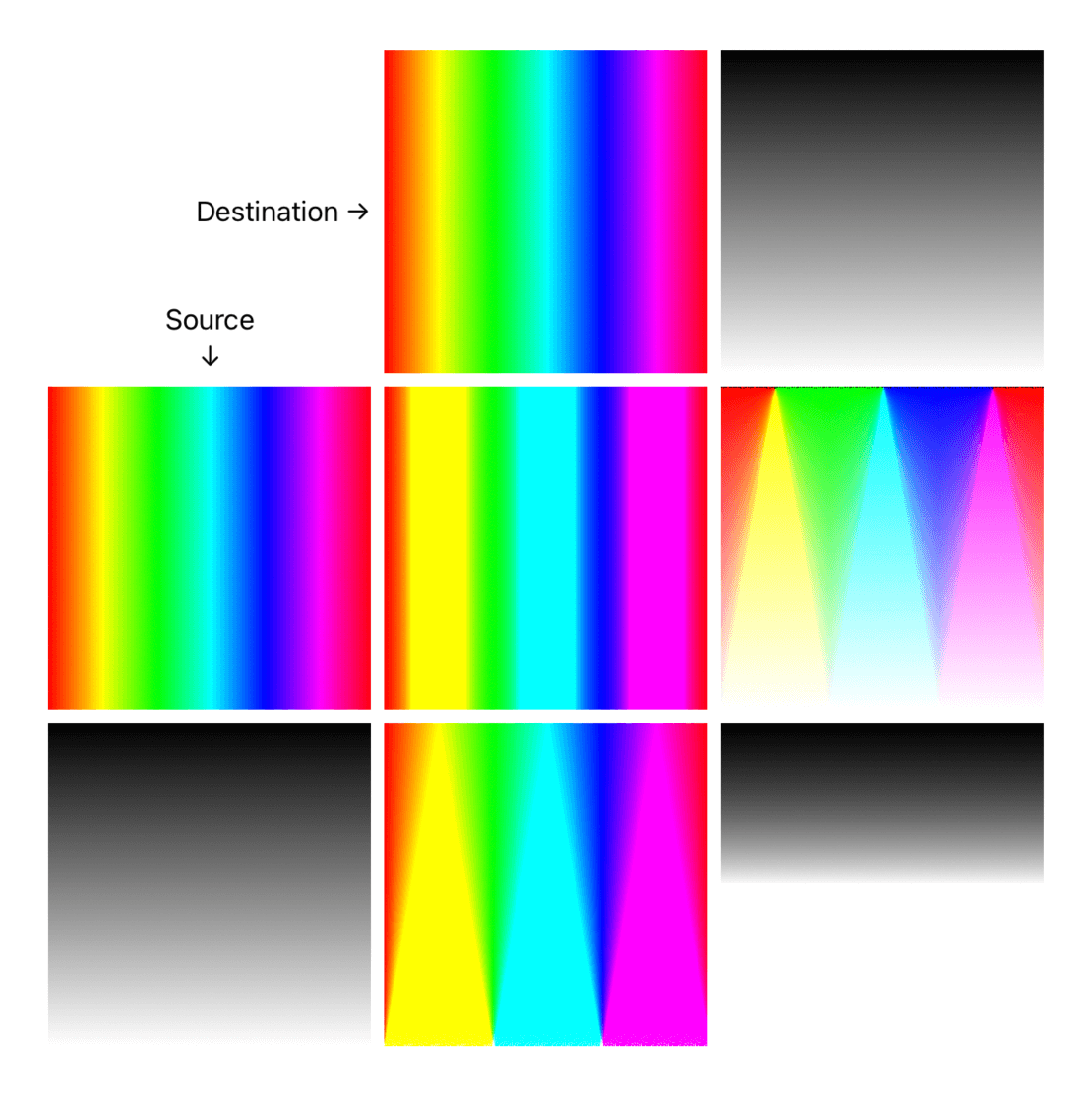
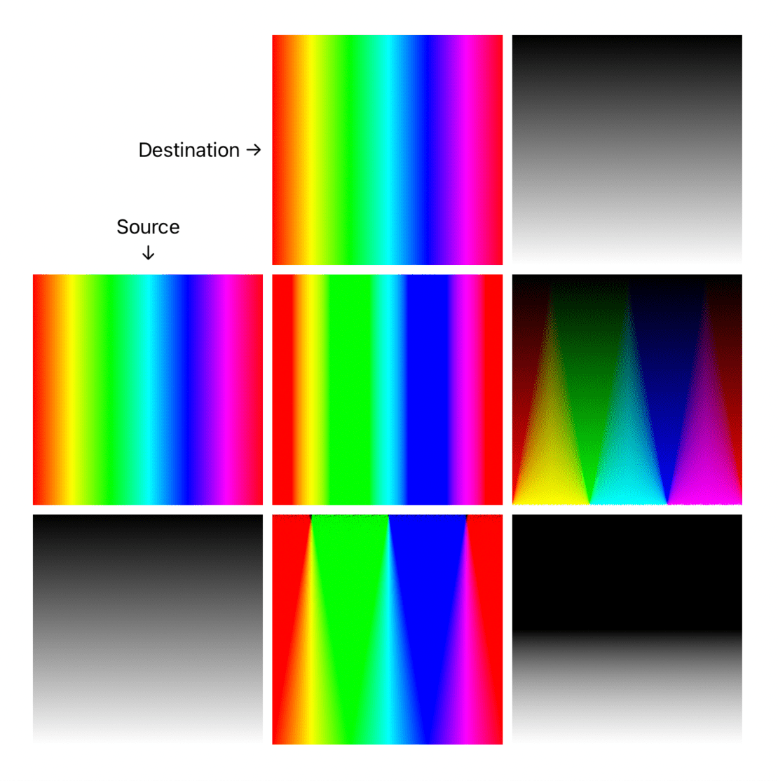
lighten- (opposite ofdarken) compares and draws the brighter colors of either source or destination (if every point of the source view is darker than the destination, the outcome is just the destination)
screen- (can be thought to be the opposite ofmultiply) inverts the destination colors and blends them with the source, then inverts the result. The resulting colors are lighter than the original colors, with less contrast. Screening with black leaves the color unchanged. Screening with white produces white.
plusLighter- (a.k.a. Linear Dodge, opposite ofplusDarker) brightens each destination color channel to reflect the source color. Blending with black produces no change.
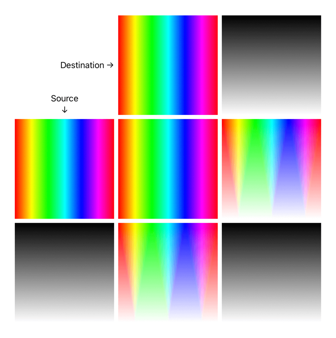
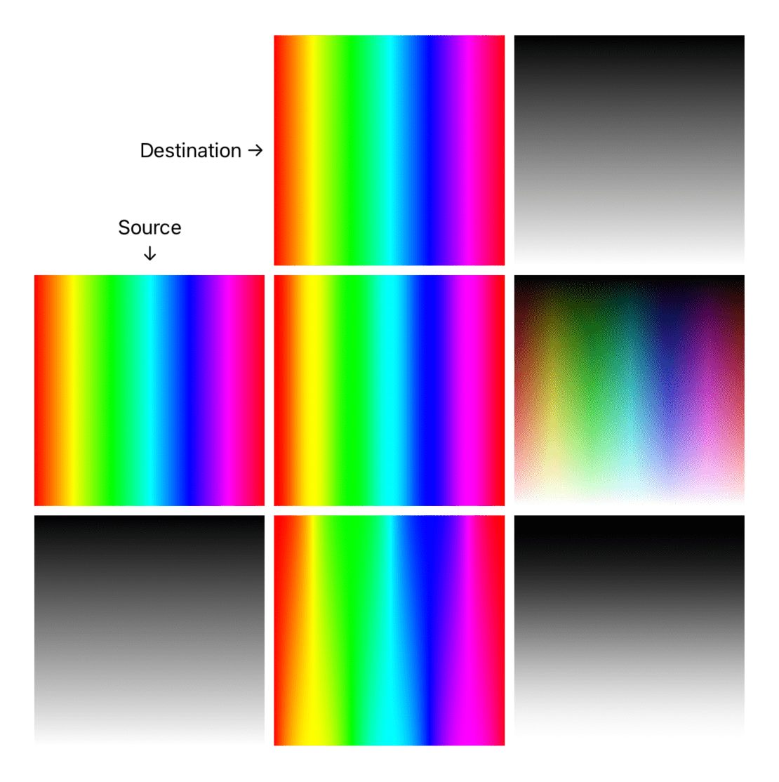
Darken
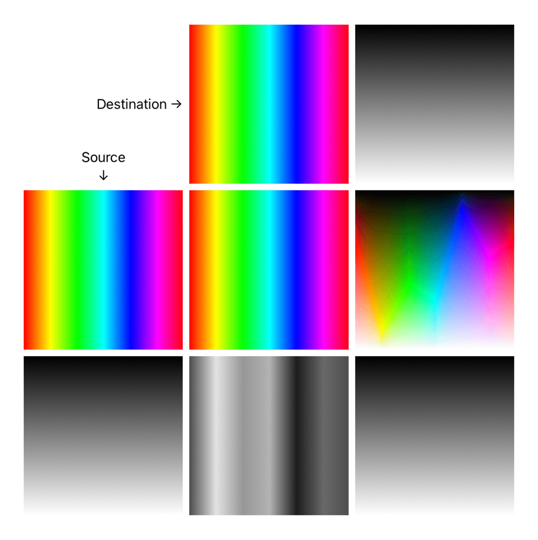
The destination will get darker by blending the hue of both source and destination. Pure white is the neutral color.
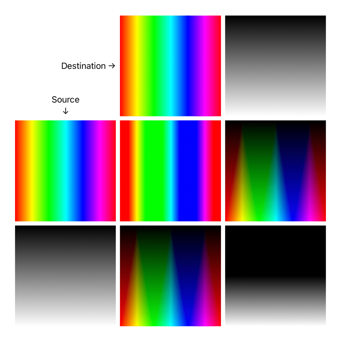
colorBurn- (opposite ofcolorDodge) Intensifies the dark areas in all layers. The effect increases the contrast between the source and destination.
darken- (opposite oflighten) compares and draws the darker colors of either source and destination (if every point of the source view is lighter than the destination, the outcome is just the destination)
multiply- (can be thought as opposite ofscreen) multiplies each channel colors of both source and destination. Multiplying any color with black produces black. Multiplying any color with white leaves the color unchanged.
plusDarker- (a.k.a. Linear Burn, opposite ofplusLighter) darkens each source color channel to reflect the destination color. Blending with white produces no change.
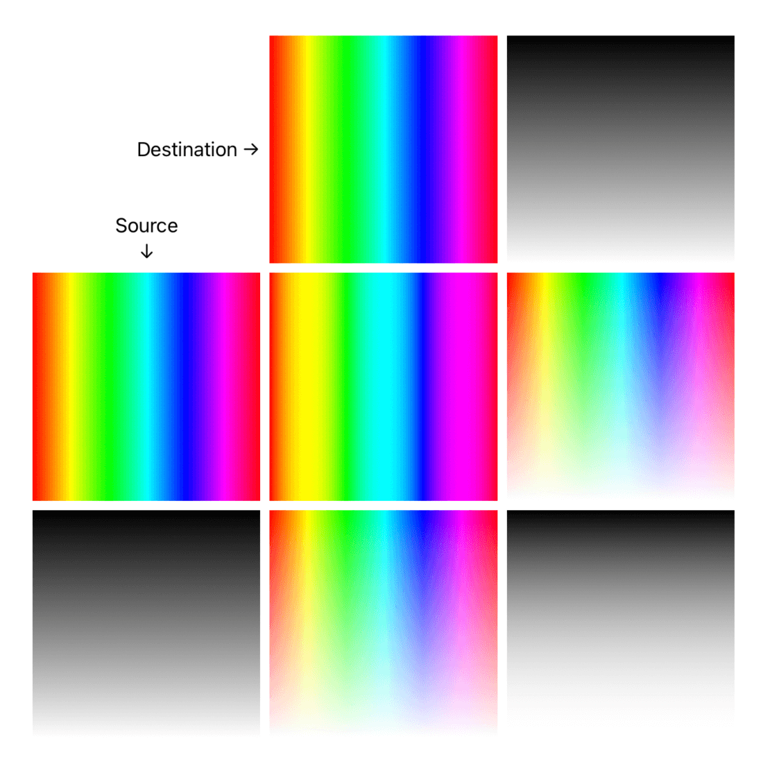
Contrast
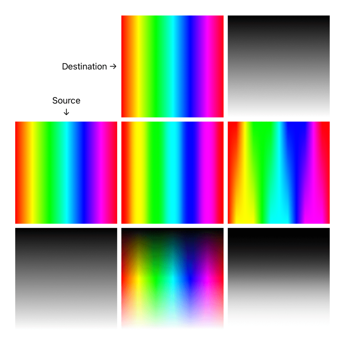
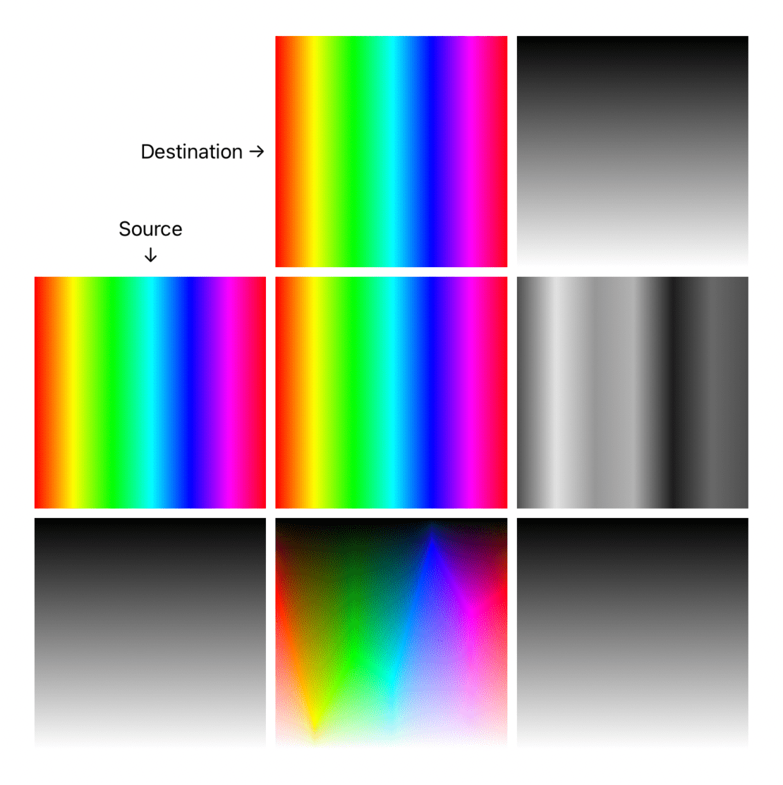
The following blend modes create contrast by both lightening the lighter areas and darkening the darker areas in the destination. The outcome is more vibrant colors.
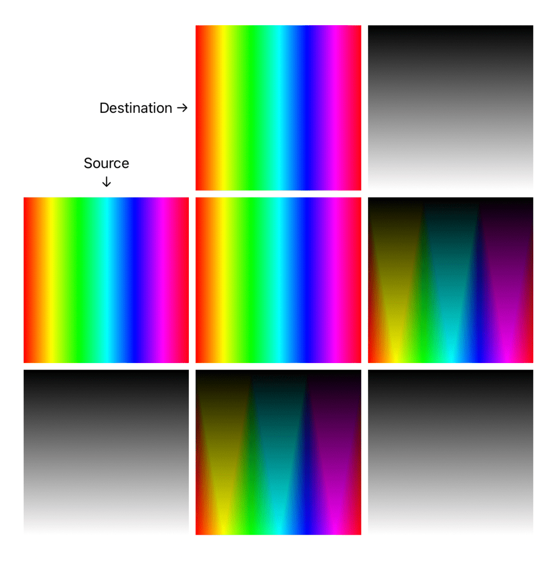
overlay- (opposite ofhardLight, can be thought as combination ofmultiplyandscreen) darker colors in the source intensify the destination colors, while lighter colors in the destination wash out the source. Where the source is light, the destination becomes lighter. Where the source is dark, the destination becomes darker.
softLight- softer version ofoverlay, Applies a half-strengthscreento lighter areas, and half-strengthmultiplyto darker areas of the source.
hardLight- based on the source color brightness, if it's dark, applyscreen, applymultiplyotherwise.
Component
These blend modes output a result based on one property/component of the source, and all others from the destination:
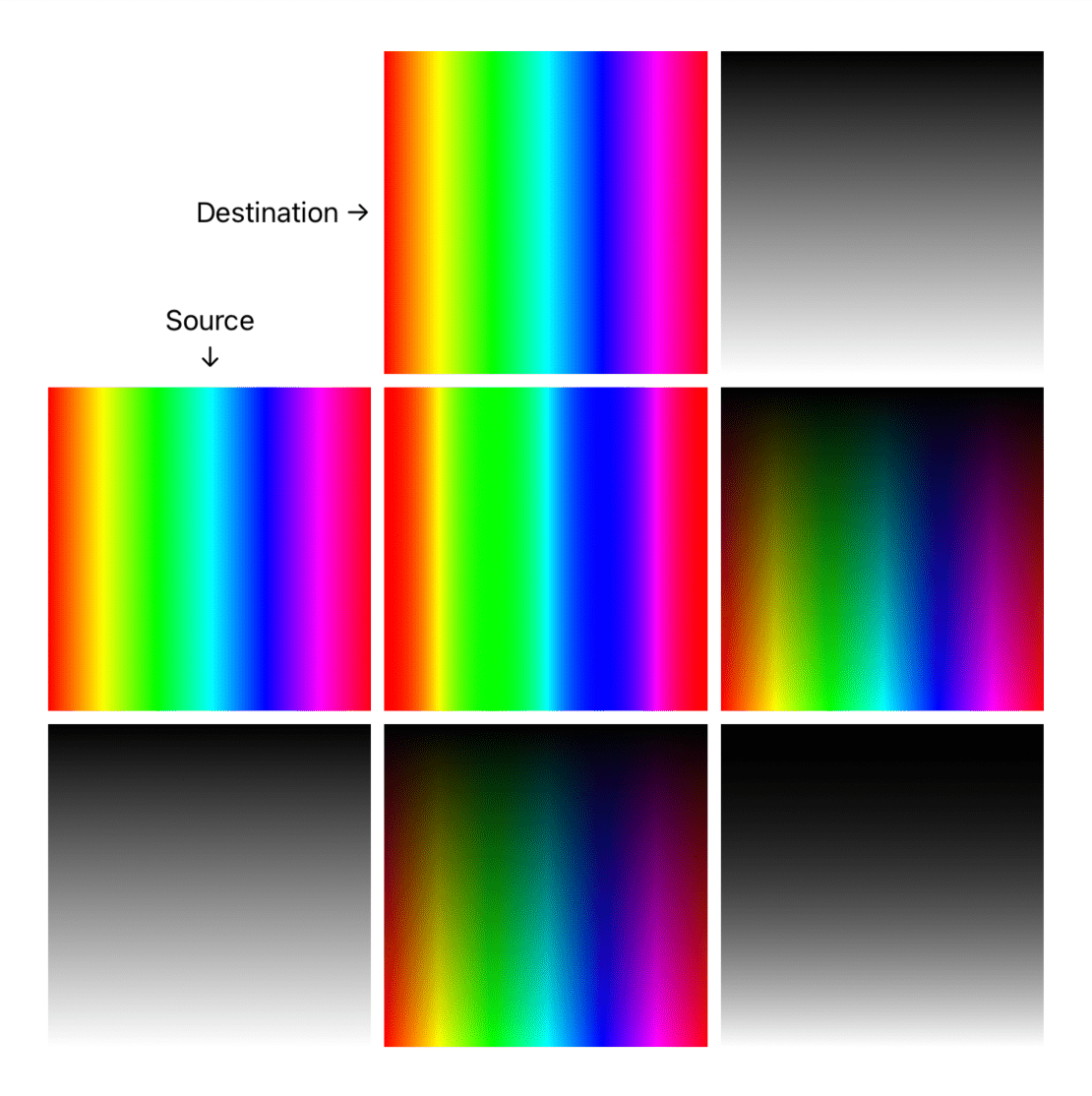
hue- Uses hue from the source, luminosity and saturation from the destination.
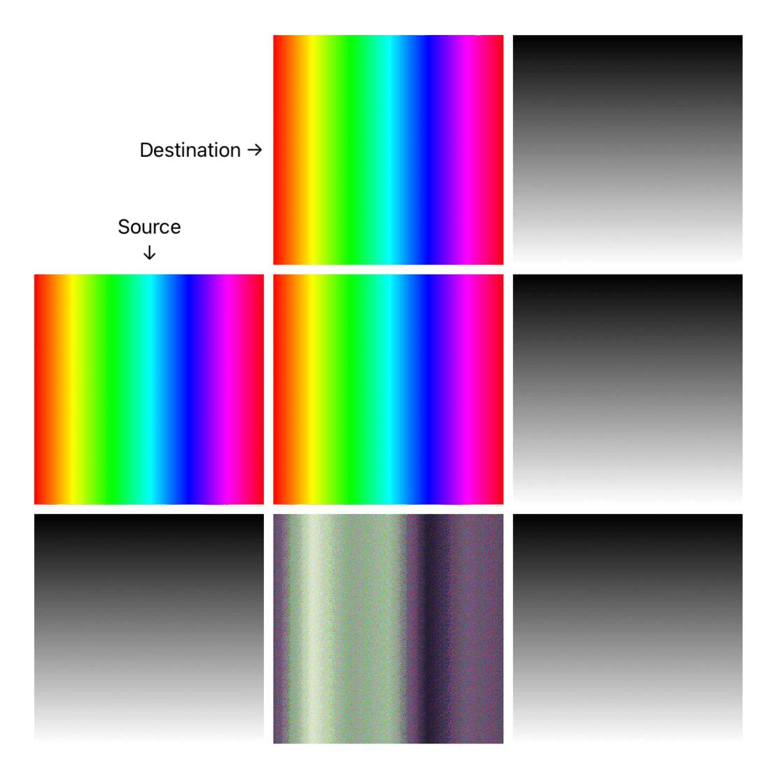
saturation- Uses saturation from the source, luminosity and hue from the destination.
color- (opposite ofluminosity) Uses luminosity from the destination, saturation and hue from the source.
luminosity- (opposite ofcolor) Uses luminosity from the source, saturation and hue from the destination.
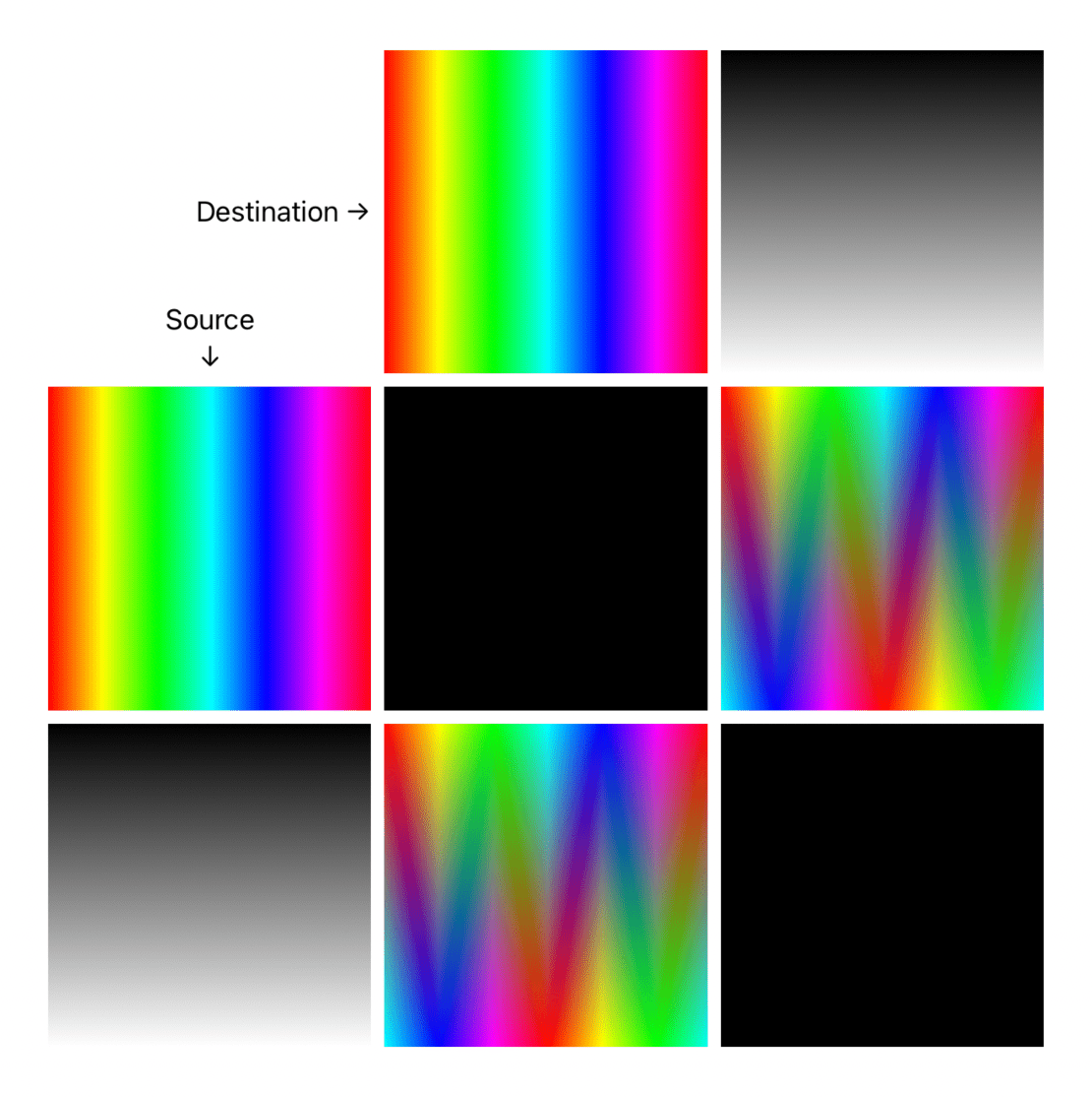
Compositing
These blend modes apply different masks to both source and destination. For more options in SwiftUI, check out the three-part SwiftUI masking series.
sourceAtop- the source is placed only where it's over the destination.
destinationOver- the destination is placed over the source.
destinationOut- the destination is shown only where it's not underneath the source (we used this to create a inverse mask view modifier).
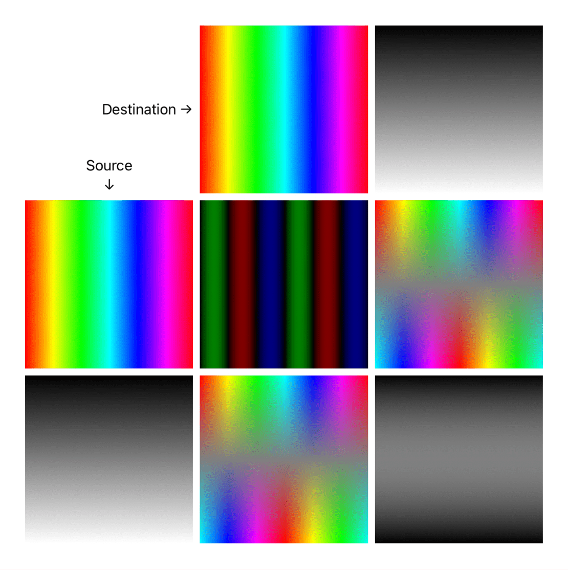
Invert
Invert blend modes either invert or cancel out source colors depending on destination colors.
difference- subtracts the darker of the two colors (from destination and source) from the lighter color. If either source or destination is all white, this blend inverts the other view colors.
exclusion- similar todifference, but the outcome has lower contrast
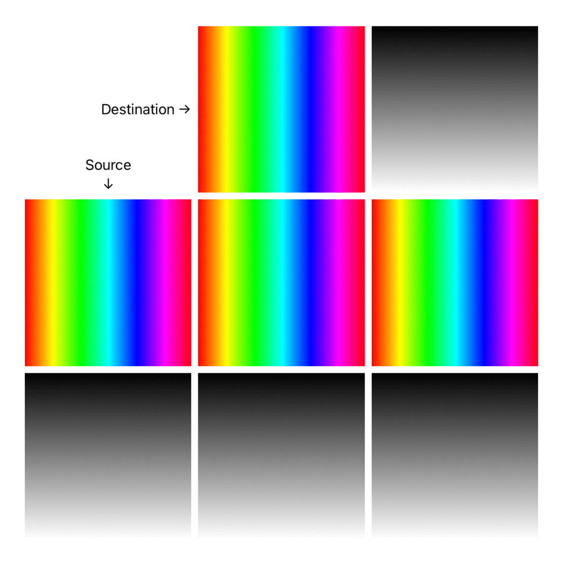
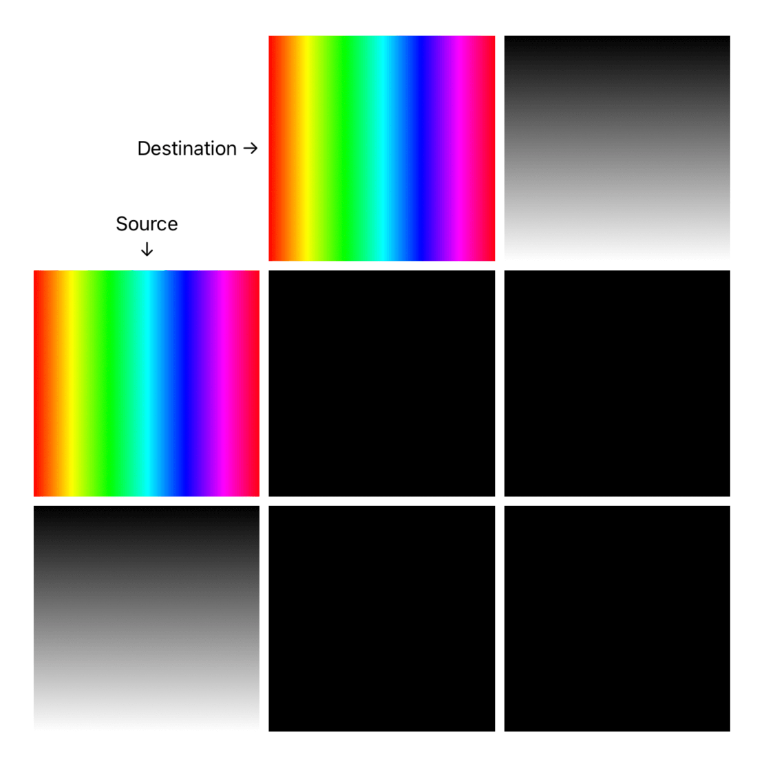
Normal
normal- the default behavior, this is needed as blending modes propagate via SwiftUI's environment.
Applying multiple blend modes
When we apply multiple blending modes, it's helpful to think that:
- the source is what we are currently drawing
- the destination is what has been drawn so far
If we apply multiple blend modes to the same view, only the closest one will take effect:
ZStack {
  Destination()
  Source()
    .blendMode(.color) // applied
    .blendMode(.destinationOut) // discarded
    .blendMode(.multiply) // discarded
}
This is consistent with other (photo editing) software. The source view is only one part of the equation. Applying blend modes without a destination is a no-op.
Things get more interesting when we apply different blend modes to different layers. Let's make an example:
ZStack {
  BottomView()
  MidView()
    .blendMode(...)
  TopView()
    .blendMode(...)
}
Here we will:
- blend
BottomView(destination) withMidView(source) usingMidView's blend mode - blend the
BootomView+MidViewoutput (destination) withTopView(source) usingTopView's blend mode
This is just an example, but the blending possibilities will just grow from here.
Wait, it's all CIFilters?
If we dig into SwiftUI's Environment, we see that our SwiftUI.BlendMode is translated into a CALayer.compositingFilter:
[...]
- SwiftUI.DisplayList.ViewUpdater.ViewCache
▿ value: SwiftUI.DisplayList.ViewUpdater.ViewInfo
  [...]
  - layer: <
    CALayer: ...;
    [...]
    compositingFilter = colorBurnBlendMode // 👈🏻
  >
[...]
This shouldn't come as a surprise, but it's a good reminder that SwiftUI stands on the shoulders of giants.
CIFilter goes well beyond just blending and compositing, Apple has excellent documentation, with images, here.
All
SwiftUI.BlendModecases have "No overview available." as documentation (FB9620110).
Conclusions
Blending might not be something we reach out to daily when building our apps, but it's a great tool to have at our disposal, and SwiftUI makes it very simple to use.
We've seen a few examples in this article, but I invite you to download the sample code, experiment with different views, and see the wide variety of results that you can get.
Do you use blending in SwiftUI? Please feel free to show me your work on Twitter! Thank you for reading.