Every SwiftUI protocol explained
 @zntfdr
Did you know that SwiftUI defines 54 protocols? Let's have a look at all of them!
Core protocols
ViewViewModifierAppScene
SwiftUI is all about declaring and modifying views: it should come with no surprise that two of the most important protocols are View and ViewModifier, which let us define our own views and our own view modifiers.
Furthermore, from Xcode 12 SwiftUI has gained the complete app life cycle thanks to App and Scene, allowing us to build SwiftUI apps from the start.
@main
struct FiveStarsApp: App {
  var body: some Scene {
    WindowGroup {
      ContentView()
    }
  }
}
Styles
ButtonStyleDatePickerStyle(iOS, macOS)GaugeStyle(watchOS)GroupBoxStyle(iOS, macOS)IndexViewStyle(iOS, tvOS)LabelStyleListStyleMenuButtonStyle(macOS)MenuStyle(iOS, macOS)NavigationViewStylePickerStylePrimitiveButtonStyleProgressViewStyleShapeStyleTabViewStyleTextFieldStyleToggleStyleWindowStyle(macOS)WindowToolbarStyle(macOS)
With 19 definitions, this is the biggest category of SwiftUI protocols:
styles are similar to view modifiers, but instead of being applied to all views, they're applied only to specific views (e.g. Labels, Buttons, ...).
To apply a style we use the associated view modifier xxStyle(_:) (e.g. buttonStyle(_:)), where we can pass any of the predefined SwiftUI styles, or even our own.
Button("Rounded rectangle + shadow button style") {
  // button tapped
}
.buttonStyle(RoundedRectangleWithShadowedLabelButtonStyle())
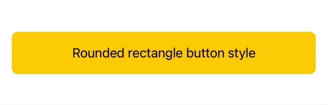
Example from Exploring SwiftUI's
Buttonstyles.
An important feature of styles is that their modifier can be applied to any view, and all matching subviews will automatically inherit said style:
VStack {
  Label("One", systemImage: "1.circle.fill")
  Label("Two", systemImage: "2.circle.fill")
  Label("Three", systemImage: "3.circle.fill")
}
.labelStyle(ShadowLabelStyle())
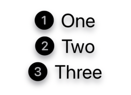
Example from our
Labeldeep dive.
Widgets (iOS, macOS)
WidgetWidgetBundleWidgetConfiguration
These are part of the new SwiftUI features that we gained thanks to WidgetKit.
Widgets not only are one of the main highlights of iOS 14/macOS 11, but also come with their own set of protocols and definitions.
More specifically these protocols lets us declare and configure all our apps widgets via code:
@main
struct FSWidgets: WidgetBundle {
  var body: some Widget {
    LatestArticleWidget()
    NewArticlesListWidget()
  }
}
This approach is a clear departure from previous declarations such as SiriKit intents (done via .intentdefinition files) and Core Data models (declared via a .xcdatamodeld file).
Having such declarations in code makes things more straightforward, and give developers easy and direct access to them, avoiding the need for Xcode to extract and generate them at build time, like it has to do for SiriKit intents and Core Data models. Hopefully we will see this trend continue at this year WWDC.
Shapes
ShapeInsettableShape
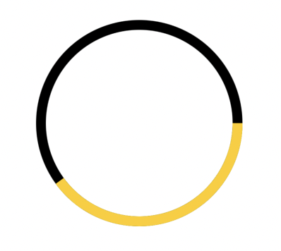
SwiftUI comes with many shapes such as Rectangle and Circle: instead of limiting our choices to the built-in offering, we can expand SwiftUI's catalog by defining our own shapes conforming to these shape protocols.
struct ContentView: View {
  var body: some View {
    ZStack {
      Circle()
        .stroke(Color.black, lineWidth: 10)

      ProgressCircle(progress: 0.4)
        .stroke(Color.yellow, lineWidth: 10)
    }
  }
}

struct ProgressCircle: Shape {
  var progress: CGFloat

  func path(in rect: CGRect) -> Path {
    let centerX: CGFloat = rect.width / 2
    let centerY: CGFloat = rect.height / 2

    var path = Path()
    path.addArc(
      center: CGPoint(x: centerX, y: centerY),
      radius: min(centerX, centerY),
      startAngle: Angle(degrees: 0),
      endAngle: Angle(degrees: 360 * Double(progress)),
      clockwise: false
    )

    return path
  }
}
Animations
AnimatableAnimatableModifierGeometryEffectVectorArithmetic
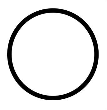
Thanks to SwiftUI's declarative nature, animation bugs have basically disappeared: no longer we need to track and manage canceling transitions, calculate the right spring value based on gestures speed, etc.
Animations in SwiftUI are state-based (like everything else): as long as our view is on screen, the right animation for the given state change will happen automatically.
Javier Nigro has a great Advanced SwiftUI Animations deep dive into this.
struct ContentView: View {
  @State var progress: CGFloat = 0

  var body: some View {
    ZStack {
      Circle()
        .stroke(Color.black, lineWidth: 10)

      ProgressCircle(progress: progress)
        .stroke(Color.yellow, lineWidth: 10)
        .animation(Animation.linear.speed(0.4))
        .onAppear {
          progress = 1
        }
    }
  }
}

struct ProgressCircle: Shape {
  var progress: CGFloat

  // 👇🏻 Animatable protocol requirement.
  var animatableData: CGFloat {
    get { progress }
    set { progress = newValue }
  }

  func path(in rect: CGRect) -> Path {
    let centerX: CGFloat = rect.width / 2
    let centerY: CGFloat = rect.height / 2

    var path = Path()
    path.addArc(
      center: CGPoint(x: centerX, y: centerY),
      radius: min(centerX, centerY),
      startAngle: Angle(degrees: 0),
      endAngle: Angle(degrees: 360 * Double(progress)),
      clockwise: false
    )

    return path
  }
}
Environment
EnvironmentKeyEnvironmentalModifier
SwiftUI's environment is one of the many ways we use to pass data within our view hierarchy, EnvironmentKey lets us inject our own data in the environment, while EnvironmentalModifier lets us return view modifiers based on the current environment:
struct AnimatableEnvModifier: EnvironmentalModifier {
  func resolve(in environment: EnvironmentValues) -> some ViewModifier {
    AnimatableModifier(
    	isReduceMotionEnabled: environment.accessibilityReduceMotion
    )
  }

  struct AnimatableModifier: ViewModifier {
    let isReduceMotionEnabled: Bool

    func body(content: Content) -> some View {
      content
        .animation(isReduceMotionEnabled ? .none : .easeInOut)
    }
  }
}

FSView()
  .modifier(AnimatableEnvModifier())
Previews
PreviewContextPreviewContextKeyPreviewProvider
With SwiftUI's introduction we have also gained Xcode previews, which speeds up immensely building and testing views right from Xcode, without the need to launch our app.
Xcode previews come with a set of protocols that let us declare and set the right context for each preview.
struct FSWidget_Previews: PreviewProvider {
  static var previews: some View {
    Group {
      LatestArticleWidgetView(configuration: FSWidgetIntent())
      LatestArticleWidgetView(configuration: FSWidgetIntent())
        .environment(\.colorScheme, .dark)
    }
    .previewContext(WidgetPreviewContext(family: .systemSmall))
  }
}
Legacy bridges
UIViewControllerRepresentable(iOS)UIViewRepresentable(iOS)NSViewControllerRepresentable(macOS)NSViewRepresentable(macOS)WKInterfaceObjectRepresentable(watchOS)
While SwiftUI is incredibly powerful per se, at launch most Apple's frameworks did not offer a correspondent SwiftUI view: think MFMailComposeViewController or UIImagePickerController for example.
Instead of making it impossible to access such views, SwiftUI offers a set of protocols that functions as bridge to these legacy views that are not yet natively available in SwiftUI.
As a bonus, these protocols let us access our own legacy view definitions, making it easy to migrate to SwiftUI without having to re-write our own UI completely from scratch.
@available(iOS, introduced: 13, deprecated: 14, message: "Use SwiftUI's ProgressView")
public struct ActivityIndicator: UIViewRepresentable {
  let isAnimating: Bool
  let style: UIActivityIndicatorView.Style

  public init(isAnimating: Bool, style: UIActivityIndicatorView.Style) {
    self.isAnimating = isAnimating
    self.style = style
  }

  public func makeUIView(
    context: UIViewRepresentableContext<ActivityIndicator>
  ) -> UIActivityIndicatorView {
    UIActivityIndicatorView(style: style)
  }

  public func updateUIView(
    _ uiView: UIActivityIndicatorView,
    context: UIViewRepresentableContext<ActivityIndicator>
  ) {
    isAnimating ? uiView.startAnimating() : uiView.stopAnimating()
  }
}

Responder chain
CommandsFocusedValueKey
The responder chain is one of the many SwiftUI victims: there's no exact equivalent for this concept, on the other hand SwiftUI offers various replacements such as Commands and FocusedValueKey.
These protocols let us define our own ways to deal with various events coming from different parts of the app, this is something I look forward to see further explored at this year's WWDC.
@main
struct FSApp: App {
  var body: some Scene {
    WindowGroup {
      ContentView()
    }
    .commands {
      CommandMenu("Five Stars menu") {
        Button("Secret action") {
          // "Five Stars menu/Secret action" has been triggered.
        }.keyboardShortcut("f")
      }
    }
  }
}
Toolbar
ToolbarContentCustomizableToolbarContent
When declaring toolbars, we add items via one of the three .toolbar(content:) view modifiers:
while one of them accepts any view via a @ViewBuilder content: () -> Content parameter, the other two accept a @ToolbarContentBuilder content: () -> Content parameter instead, where the content is either conforming to ToolbarContent or CustomizableToolbarContent.
These last two view modifiers will probably let SwiftUI further optimize/organize the toolbar.
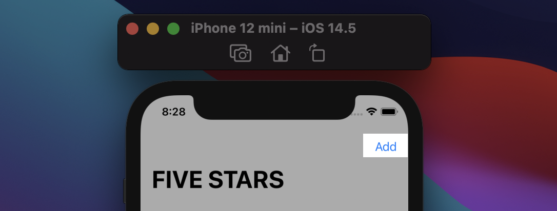
struct ContentView: View {
  var body: some View {
    NavigationView {
      FSView()
        .toolbar {
          ToolbarItem(id: "add-action") {
            Button("Add", action: {
              // add action triggered
            })
          }
        }
      .navigationTitle("FIVE STARS")
    }
  }
}
Documents (iOS, macOS)
FileDocumentReferenceFileDocument
Both protocols are used to define the supported file type in a document based app:
@main
struct FSApp: App {
  var body: some Scene {
    DocumentGroup(newDocument: TextDocument()) { file in
      ContentView(document: file.$document)
    }
  }
}

struct TextDocument: FileDocument {
  static var readableContentTypes = [UTType.plainText]
  var text = ""

  init(configuration: ReadConfiguration) throws {
    if let data = configuration.file.regularFileContents{
      text = String(data: data, encoding: .utf8) ?? ""
    } else {
      throw CocoaError(.fileReadCorruptFile)
    }
  }

  func fileWrapper(configuration: WriteConfiguration) throws -> FileWrapper {
    let data = text.data(using: .utf8)!
    return .init(regularFileWithContents: data)
  }

  init(initialText: String = "") {
    text = initialText
  }
}
One-off protocols
Lastly, we have a few protocols that do not belong to any particular group, let's have a run through all of them!
Custom alignment
AlignmentID
When playing with frames and spacers doesn't cut it, SwiftUI lets us define our own powerful alignments, applicable among multiple views in different stacks.
public extension VerticalAlignment {
  struct CustomAlignment: AlignmentID {
    public static func defaultValue(in context: ViewDimensions) -> CGFloat {
      context[VerticalAlignment.center]
    }
  }

  static let navigationTitle = VerticalAlignment(CustomAlignment.self)
}


struct ContentView: View {
  var body: some View {
    ZStack(alignment: Alignment(horizontal: .center, vertical: .navigationTitle)) {
      Color.yellow
        .frame(width: 200, height: 40)
        .alignmentGuide(.navigationTitle) { $0[VerticalAlignment.top] }

      Text("FIVE STARS")
        .font(.title)
        .alignmentGuide(.navigationTitle) { $0[VerticalAlignment.center] }
    }
  }
}

Reading child values
PreferenceKey
While most SwiftUI communications are propagated from parent to child views, sometimes it's the children that need to communicate to their parents. In such cases there's PreferenceKey, which we took a deep dive on in PreferenceKey's reduce method demystified.
extension View {
  @warn_unqualified_access
  func readSize(onChange: @escaping (CGSize) -> Void) -> some View {
    background(
      GeometryReader {
        Color.clear
          .preference(key: SizePreferenceKey.self, value: $0.size)
      }
    )
    .onPreferenceChange(SizePreferenceKey.self, perform: onChange)
  }
}

private struct SizePreferenceKey: PreferenceKey {
  static var defaultValue = CGSize.zero
  static func reduce(value: inout Value, nextValue: () -> Value) { }
}
We created this extension in Sharing layout information in SwiftUI, with the addition of the
@warn_unqualified_accessattribute.
Advanced drop management
DropDelegate
While the delegation pattern has been replaced by closures in SwiftUI (e.g. onAppear(perform:)), there's one exception: DropDelegate.
This protocol lets us receive various drop events and even filter/stop drops in our views.
Javer has a great writeup into this.
struct FSDropDelegate: DropDelegate {

  func validateDrop(info: DropInfo) -> Bool {
    true // Accept or reject the drop here.
  }

  func dropEntered(info: DropInfo) {
    // "Drop entered the view" event. Use this to shows that the view can accept
    // the object.
  }

  func performDrop(info: DropInfo) -> Bool {
    true // Executed when the user "drops" their object into the view.
  }
}
SwiftUI property wrappers
DynamicProperty
As covered in A sneak peek into SwiftUI's graph, SwiftUI uses this protocol to find all views whose data needs to be managed and observed by SwiftUI itself.
Furthermore, as we've seen in Let's build @State, we can use this protocol ourselves to define our own property wrappers recognized by SwiftUI.
@propertyWrapper
struct AlternativeState<V>: DynamicProperty {
@State var wrappedValue: V
var projectedValue: Binding<V> {
Binding(
get: { wrappedValue },
set: { wrappedValue = $0 }
)
}
}
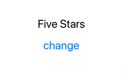
struct ContentView: View {
@AlternativeState var text = "Five Stars"
var body: some View {
VStack {
Text(text)
Button("change") {
text = ["five", "stars"].randomElement()!
}
}
}
}
Data collection views
DynamicViewContent
DynamicViewContent is used by special views that come with an associated and generic data collection:
views that conform to this method gains various modifiers such as onInsert and others, letting SwiftUI change the underlying data.
So far it's conformed only by ForEach, but our own view definitions can conform to it, too.
ForEach(items) { item in
  Text(item.title)
}
.onDelete(perform: { ... })
.onMove(perform: { ... })
Gestures
Gesture
Last but not least, SwiftUI comes with many gestures, which are all grouped together under the Gesture protocol.
This protocol also comes with various events our views can subscribe to, such as onEnded(_:) and updating(_:body:).
Just like Views, we can compose multiple gestures together, combining simultaneous, sequential, or exclusive gestures.
struct ContentView: View {
  var body: some View {
    // 👇🏻 a Gesture
    let longPressDragGesture = LongPressGesture(minimumDuration: 0.5)
      .sequenced(before: DragGesture())
      .onEnded { value in
        // gesture has ended event.
      }

    Text("Five Stars")
      .gesture(longPressDragGesture)
  }
}
Conclusions
There you have it! In this article we've covered all fifty-four public protocols that make SwiftUI what it is today.
We definitely don't need to know all of them in order to build amazing products, still it's quite handy to know what to reach for whenever we have a new challenge in front of us.
If I've missed anything or if you have any feedback please feel free to reach me out via email or Twitter, thank you!