SwiftUI features in WidgetKit
 @zntfdr
This year we've gained new SwiftUI features designed for WidgetKit: let's explore what they are.
.redacted
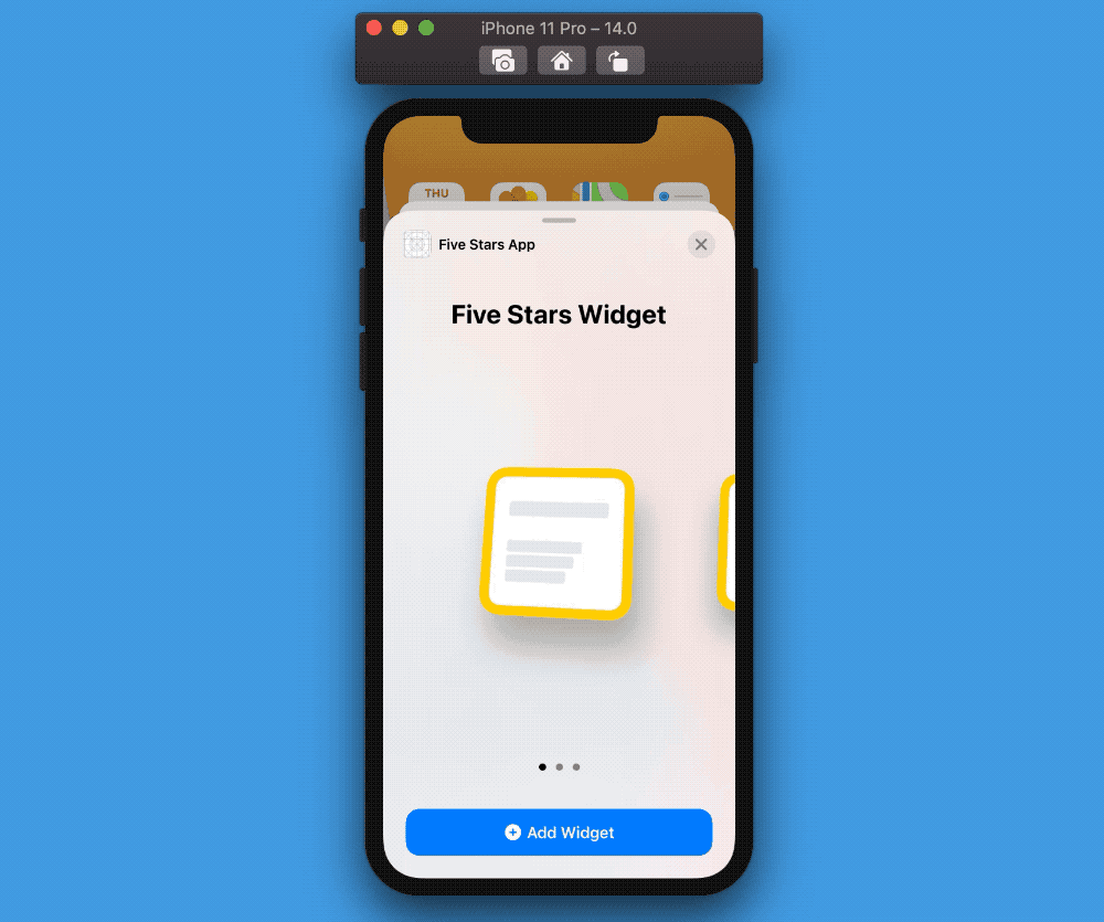
Released in Xcode 12b3, the .redacted modifier renders our views as placeholders instead of displaying the actual content.
VStack {
  Text("Five Stars")
    .font(.title2)

  Text("This")
  Text("is")
  Text("redacted!")
}
.redacted(reason: .placeholder)
If we have a Text("Five Stars") view, adding a .redacted(reason: .placeholder) modifier replaces the text with a rounded rectangle of the same length of the text, the same color as the text foreground, and some opacity to let the background still show through the rectangle.
During WWDC this modifier was announced as
.isPlaceholder(_:): with the new.redacted(reason:)API, the SwiftUI team can add different placeholder styles (a.k.a.RedactionReasons) in the future.
Why is this for WidgetKit
When making widgets, a requirement is to provide a generic preview of our widget to be displayed in the Widget Gallery: the purpose of this gallery is to give a glimpse of the actual widget.
.redacted(reason:) is perfect for this scenario, as each widget can create its custom preview, while still being consistent with the rest.
Why this is great for SwiftUI
There are multiple scenarios where we could use this.
Imagine, for example, having a screen where the data comes from a server:
instead of displaying a spinner or an empty view, we can now display a placeholder of the final view, to be replaced as soon as the data is received.
Text Date Interpolation
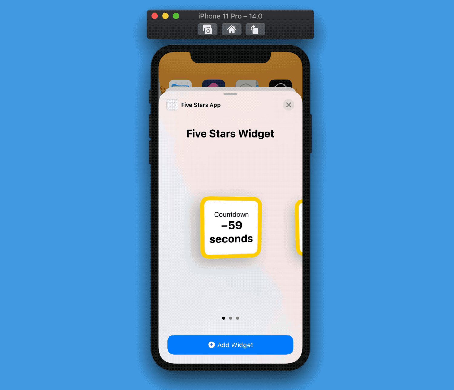
Text has gained new semantic APIs.
We can now pass a Date instance to Text and, by setting its Text.DateStyle to one of the relative options, we enable a special SwiftUI logic that knows when to refresh itself:
var body: some View {
  VStack {
    Text("Countdown")
    Text(Date().addingTimeInterval(60), style: .offset)
      .font(.title)
      .bold()
      .multilineTextAlignment(.center)
  }
}
The best part is that when this logic update happens, it won't trigger a redraw of the whole body, but just for the specific Text.
As of Xcode 12 beta 2 the dynamic text only takes as much space as needed for the first draw, meaning that if, in the future, the time to be shown requires more space, it will be truncated. This is a bug and will hopefully be fixed by the time Xcode 12 is released (FB8053971).
Why is this for WidgetKit
iOS 14 widgets are completely static: they're not interactive, we can't do animations, etc.
Using these new Text API will make our widget feel alive, despite the fact it's really not.
Why this is great for SwiftUI
While less necessary, it's still nice to have these new Text initializers that won't re-run the whole view body at every update.
Link
Link is a new SwiftUI element similar to Button, but specializes exclusively in opening URLs.
Link(
  "Visit my blog! ✨",
  destination: URL(string: "https://www.fivestars.blog")!
)
Why is this for WidgetKit
As we can't run any logic in our widgets, we cannot use SwiftUI buttons:
however, any medium/large widget can have multiple elements that, when tapped, deep link into the main app. This behavior is possible thanks to Links.
Why this is great for SwiftUI
Link makes it more apparent what the wrapped element functionality is without worrying about other side effects that we could add in a regular Button action.
Besides universal links,
Linkcan also open an URL on the device's default browser.
ContainerRelativeShape
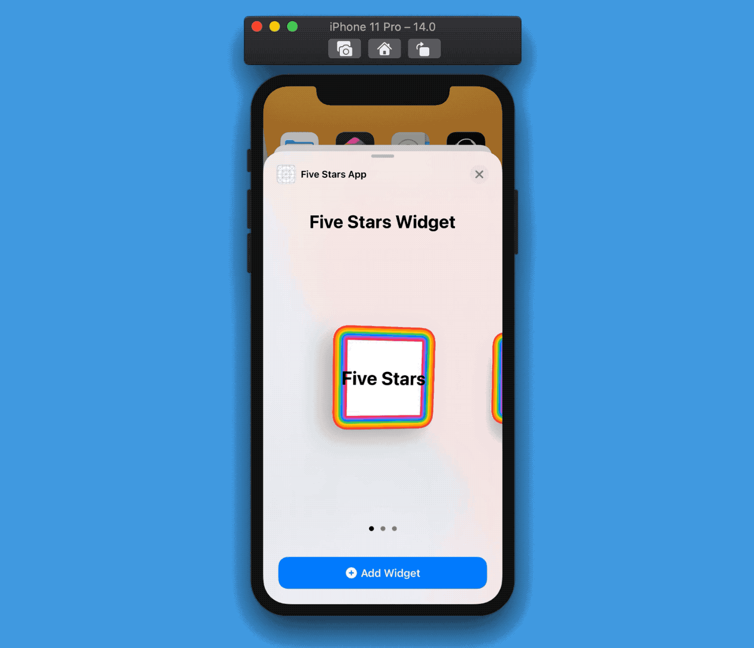
Note how the rainbow colors follow the widget shape.
ContainerRelativeShape lets us get a hold of the Shape of our view container.
struct PlaceholderView: View {
  let colors: [Color] = [.red, .orange, .yellow, .green,
                         .blue, .purple, .pink, .white]
  var body: some View {
    ZStack {
      ForEach(0..<colors.count) { index in
        ContainerRelativeShape()
          .inset(by: CGFloat(index) * 3)
          .fill(colors[index])
      }

      Text("Five Stars")
        .font(.title)
        .bold()
    }
  }
}
Why is this for WidgetKit
Currently, ContainerRelativeShape is used mainly to get the widget shape:
this is needed because different devices have different widget shapes and sizes, making it tricky to have a proper widget border to fit all widgets.
Why this is great for SwiftUI
While ContainerRelativeShape is great for widgets, in future betas it will be possible to use it with the .clipShape modifier.
It might be a long shot, but it would be great if we could use it to also get the shape of the device our app is running on: think for example the screen shape of an Apple Watch or an iPad pro.
These are small details but would unlock designs simply not possible at this moment.
If you agree, please feel free to dump my feedback: FB7953118
.widgetURL
Link works only on medium-/large-sized widgets. The widget itself is a tappable button for the small family: what URL the widget deep links to is set via the .widgetURL modifier.
If we don't set .widgetURl in our widget, tapping it will just open the app.
struct FiveStarsWidgetView: View {
  var body: some View {
    FSWidget()
      .widgetURL(URL(string: "fivestars.blog"))
  }
}
Despite being part of SwiftUI, this modifier currently has no use besides in WidgetKit (as of Xcode 12b2).
And More
We've also gained more SwiftUI elements, such as WidgetPreviewContext to preview widgets with the proper preview layout in the canvas, onBackgroundURLSessionEvents to fetch data in our widgets, but those are within the WidgetKit framework, therefore out of this article scope.
Conclusions
Even if we don't plan to implement widgets in our apps, these new SwiftUI elements can undoubtedly benefit any SwiftUI app. While some feature might not ever be used outside WidgetKit, it's still nice to have more choices when building our next app.
Are you going to add a widget to your app? Will you use any of the new features somewhere else? I would love to know 😃
Thank you for reading, and stay tuned for more SwiftUI articles!