How to make SwiftUI views adaptive
 @zntfdr
One of the most powerful aspects of SwiftUI is how it adapts based on the context:
this is SwiftUI's promise, running on all Apple devices, from the 38mm Apple Watch to the 27-inches iMac (without considering external monitors!).
While this is great and can save us hundreds of hours, sometimes we want to make our UI declarations even more adaptive: let's see how.
Our example
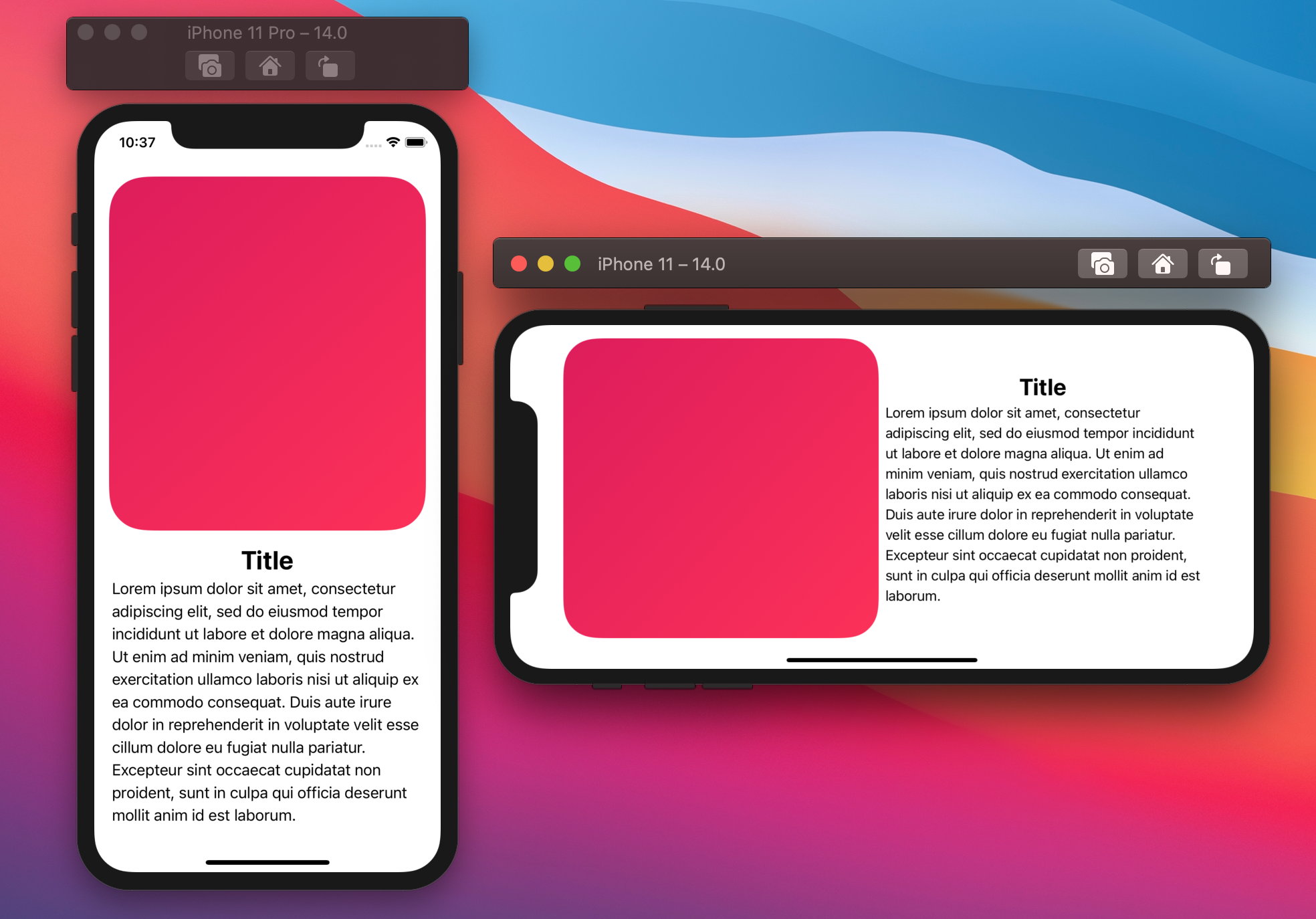
Our app has a view that we would like to adapt based on the available space.
We define two layouts, one where the content is stacked vertically and one where the content is stacked horizontally:
Even before taking care of how to pick which layout, let's define a generic reusable view, AdaptiveView:
struct AdaptiveView<Content: View>: View {
  var content: Content

  public init(@ViewBuilder content: () -> Content) {
    self.content = content()
  }

  var body: some View {
    if /* condition here */ {
      HStack {
        content
      }
    } else {
      VStack {
        content
      }
    }
  }
}
We will fill in the condition later on.
Our example view will be able to use this new definition, where all it needs to declare is the content, AdaptiveView manages everything else:
var body: some View {
  AdaptiveView {
    RoundedRectangle(...)
      .fill(...)
      .frame(maxHeight: 400)

    VStack {
      Text("Title")
        .bold()
        .font(.title)

      Text(...)
        .fixedSize(horizontal: false, vertical: true)
    }
  }
}
Awesome, let's now see how we can fill the AdaptiveView condition next.
For simplicity's sake, we will focus on conditions based on the horizontal space available: the same concepts can also be applied for vertical space.
Size classes
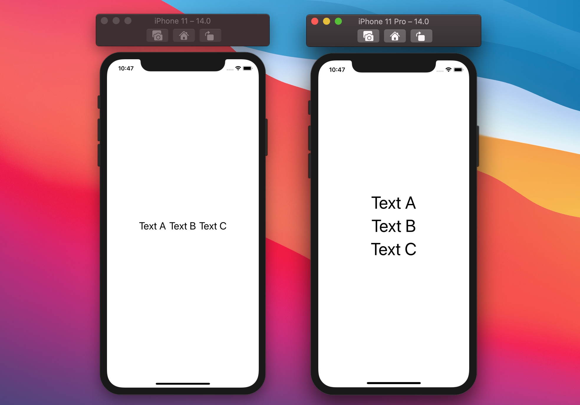
All the plus sizes iPhones have a regular horizontal size class when in landscape.
Every SwiftUI view can observe the screen size classes via two environment values: horizontalSizeClass and verticalSizeClass.
Both return a UserInterfaceSizeClass instance, which is SwiftUI's counterpart to UIKit's UIUserInterfaceSizeClass:
public enum UserInterfaceSizeClass {
  case compact
  case regular
}
In this example we can make AdaptiveView switch layout based the environment's horizontalSizeClass:
struct AdaptiveView<Content: View>: View {
  @Environment(\.horizontalSizeClass) var horizontalSizeClass
  var content: Content

  init(...) { ... }

  var body: some View {
    if horizontalSizeClass == .regular {
      // We have a "regular" horizontal screen estate:
      // we lay the content horizontally.
      HStack {
        content
      }
    } else {
      VStack {
        content
      }
    }
  }
}
Dynamic type
Another approach AdaptiveView could use is based on the environment ContentSizeCategory:
while UserInterfaceSizeClass tells us about the compact/regular size of the device screen in the current orientation, ContentSizeCategory tells us the user's preferred content size (a.k.a. dynamic type).
public enum ContentSizeCategory: Hashable, CaseIterable {
  case extraSmall
  case small
  case medium
  case large
  case extraLarge
  case extraExtraLarge
  case extraExtraExtraLarge
  case accessibilityMedium
  case accessibilityLarge
  case accessibilityExtraLarge
  case accessibilityExtraExtraLarge
  case accessibilityExtraExtraExtraLarge
}
We can use any of these cases as the condition threshold in AdaptiveView, for example we could switch layout for any size bigger than .large:
struct AdaptiveView<Content: View>: View {
  @Environment(\.sizeCategory) var sizeCategory: ContentSizeCategory
  var content: Content

  init(...) { ... }

  var body: some View {
    if sizeCategory > .large {
      VStack {
        content
      }
    } else {
      HStack {
        content
      }
    }
  }
}
SwiftUI also offers an isAccessibilityCategory property on ContentSizeCategory which we can use as well:
struct AdaptiveView<Content: View>: View {
  @Environment(\.sizeCategory) var sizeCategory: ContentSizeCategory
  var content: Content

  init(...) { ... }

  var body: some View {
    if sizeCategory.isAccessibilityCategory {
      // When the user prefers an accessibility category, lay the content vertically.
      VStack {
        content
      }
    } else {
      HStack {
        content
      }
    }
  }
}
isAccessibilityCategory returns true when the ContentSizeCategory instance is one that starts with "accessibility", this seems a good default threshold to use:
of course, we should test our implementation and see/decide if that works for us. If it doesn't, we can always fall back to another threshold.
Custom threshold
The approaches presented so far will work for most views. However, they also have a significant shortcoming: they rely on a global value.
This is great when a single AdaptiveView is the main content of the screen, but what if we have multiple views that should adapt?
If we fall into this case, we probably can't rely on these global environment properties: instead, we should make decisions for each view separately.
This way, two or more of these views can layout themselves differently, each based on their own space and threshold.
To do this, we need to take two steps:
- Obtain the available horizontal space for each
AdaptiveView - Create a condition based on that space
1. Obtain the available horizontal space
Luckily for us, we've already faced this challenge in Flexible layouts in SwiftUI (recommended read!), where we achieved the following result:
struct FlexibleView: View {
  @State private var availableWidth: CGFloat = 0

  var body: some View {
    ZStack {
      Color.clear
        .frame(height: 1)
        .readSize { size in
          availableWidth = size.width
        }

      // Rest of our implementation
    }
  }
}
We can take this and implement it in our generic AdaptiveView:
struct AdaptiveView<Content: View>: View {
  @State private var availableWidth: CGFloat = 0
  var content: Content

  public init(...) { ... }

  var body: some View {
    ZStack {
      Color.clear
        .frame(height: 1)
        .readSize { size in
          availableWidth = size.width
        }

      if /* condition */ {
        HStack {
          content
        }
      } else {
        VStack {
          content
        }
      }
    }
  }
}
...completing our first point.
2. Create a condition based on the available space
Once we have the available space, all it's left to decide is how to use it:
as we're building a generic view, it's best to leave the threshold decision to the implementer, who knows where the view is used and what the actual content is.
For these reasons, we can add a new property, threshold, which will then be used in our AdaptiveView condition:
struct AdaptiveView<Content: View>: View {
  @State private var availableWidth: CGFloat = 0
  var threshold: CGFloat
  var content: Content

  public init(
    threshold: CGFloat,
    @ViewBuilder content: () -> Content
  ) {
    self.threshold = threshold
    self.content = content()
  }

  var body: some View {
    ZStack {
      Color.clear
        .frame(height: 1)
        .readSize { size in
          availableWidth = size.width
        }

      if availableWidth > threshold {
        HStack {
          content
        }
      } else {
        VStack {
          content
        }
      }
    }
  }
}
And with this, our custom AdaptiveView is complete.
Experimentation
Since we now own the threshold, it's also easy to test different thresholds/layouts/devices, for example:
struct ContentView: View {
  @State var currentWidth: CGFloat = 0
  @State var padding: CGFloat = 8
  @State var threshold: CGFloat = 100

  var body: some View {
    VStack {
      AdaptiveView(threshold: threshold) {
        RoundedRectangle(cornerRadius: 40.0, style: .continuous)
          .fill(
            Color(red: 224 / 255.0, green: 21 / 255.0, blue: 90 / 255.0, opacity: 1)
          )
        RoundedRectangle(cornerRadius: 40.0, style: .continuous)
          .fill(
            Color.pink
          )
      }
      .readSize { size in
        currentWidth = size.width
      }
      .overlay(
        Rectangle()
          .stroke(lineWidth: 2)
          .frame(width: threshold)
      )
      .padding(.horizontal, padding)

      Text("Current width: \(Int(currentWidth))")
      HStack {
        Text("Threshold: \(Int(threshold))")
        Slider(value: $threshold, in: 0...500, step: 1) { Text("") }
      }
      HStack {
        Text("Padding:")
        Slider(value: $padding, in: 0...500, step: 1) { Text("") }
      }
    }
    .padding()
  }
}
The final project can be found here.
Not only layouts
The examples we've seen so far adapt the layout direction based on our condition. However, this is not the only use case. For instance, we can use a similar approach to show/hide part of the UI:
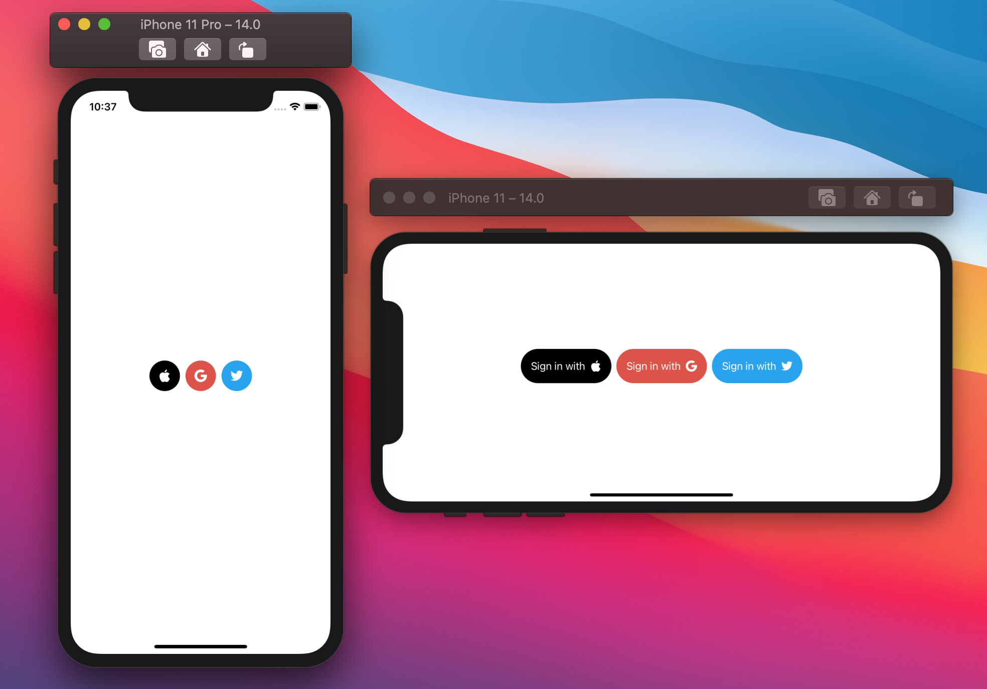
This example is also part of the final project.
Conclusions
SwiftUI tries its best to fit as best as possible in every given scenario: it's wonderful to let the framework do all the heavy lifting, however going that extra mile, with a little work from our side, can help us provide an even better user experience.
In this article, we've seen various approaches to adapting our views based on different conditions: do you use any of them? Have you seen any other alternatives? Please let me know!
Thank you for reading, and stay tuned for more articles!