How to compose SwiftUI views with @ViewBuilder
 @zntfdr
We're tasked with building a brand new iOS 13+ app, or, maybe, with migrating an app from UIKit to SwiftUI: where should we start?
Thanks to SwiftUI's composable nature, we might want to start by defining and using a design system:
once we have one, building views becomes a matter of picking the correct elements from the system and place them on screen.
Let's see how we can build a component of our design system: a text field.
The start
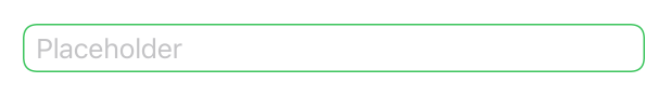
After studying the patterns from the design team, we conclude that there are two different appearances for our text fields in the app:
a default one, used when everything is ok, and an "error" one, used to tell the user that something is wrong.
Besides the appearance, all text fields have the same components: a title, a placeholder, and a border.
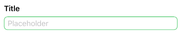 | 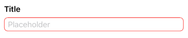 |
The two text field appearances: default and error.
With this knowledge we go ahead and build our own FSTextField:
struct FSTextField: View {
  var title: LocalizedStringKey
  var placeholder: LocalizedStringKey = ""
  @Binding var text: String
  var appearance: Appearance = .default

  enum Appearance {
    case `default`
    case error
  }

  var body: some View {
    VStack {
      HStack {
        Text(title)
          .bold()
        Spacer()
      }

      TextField(
        placeholder,
        text: $text
      )
      .padding(.horizontal, 8)
      .padding(.vertical, 4)
      .background(
        RoundedRectangle(cornerRadius: 8, style: .continuous)
          .strokeBorder(borderColor)
      )
    }
  }

  var borderColor: Color {
    switch appearance {
    case .default:
      return .green
    case .error:
      return .red
    }
  }
}
FSTextField is defined as a VStack with a title (a Text) on top and a SwiftUI TextField at the bottom: this declaration is clear and covers 100% of the known cases.
We're happy with FSTextField: we add a couple of previews and move to the next design system component.
One week later
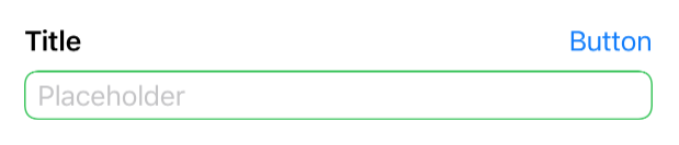
One week pass and we discover (or we're given) two new variations of our text field: the first displays a glyph on the top trailing corner, vertically aligned with the title, and the other shows a message in the same spot:
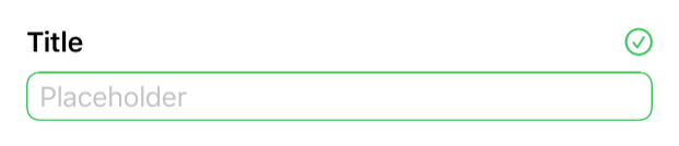 | 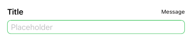 |
Fair enough, we define two new views, FSGlyphTextField and FSMessageTextField, which cover these new cases:
struct FSGlyphTextField: View {
  var title: LocalizedStringKey
  var symbolName: String
  var systemColor: Color = Color(.label)
  var placeholder: LocalizedStringKey = ""
  @Binding var text: String
  var appearance: FSTextField.Appearance = .default

  var body: some View {
    VStack {
      HStack {
        Text(title)
          .bold()
        Spacer()
        Image(systemName: symbolName)
          .foregroundColor(systemColor)
      }

      TextField(
        ...
      )
    }
  }

  var borderColor: Color {
    ...
  }
}

struct FSMessageTextField: View {
  var title: LocalizedStringKey
  var message: LocalizedStringKey
  @Binding var text: String
  var appearance: FSTextField.Appearance = .default

  var body: some View {
    VStack {
      HStack {
        Text(title)
          .bold()
        Spacer()
        Text(message)
          .font(.caption)
      }

      TextField(
        ...
      )
    }
  }

  var borderColor: Color {
    ...
  }
}
Our design system has now three text field definitions instead of one:
we could do better, but we can manage.
One more week later
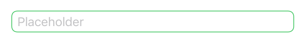
Another week pass by, and the design team adds two more variations to our text field: the first has no title, while the other has the usual title and a button on the trailing corner:
 |  |
We could define two more text field views (e.g., FSPlainTextField and FSButtonTextField); however, creating new views for each variation defeats the purpose of our design system:
what happens when the design changes and we must update the title font, or perhaps the border color?
The more (text field) definitions we have, the harder it becomes to manage each component, and the easier it is to forget to update one (or more) variation(s).
Generic text fields: core components
With the current approach, we already take advantage of SwiftUI's composability. We use all these variations when building screens; however, we can go a step further and use composability within our text fields definitions.
First, looking at the current variations, we see that there's one constant: the text field itself. Let's extract it from the definitions above:
struct _FSTextField: View {
  var placeholder: LocalizedStringKey = ""
  @Binding var text: String
  var borderColor: Color

  var body: some View {
    TextField(
      placeholder,
      text: $text
    )
    .padding(.horizontal, 8)
    .padding(.vertical, 4)
    .background(
      RoundedRectangle(cornerRadius: 8, style: .continuous)
        .strokeBorder(borderColor)
    )
  }
}
 | 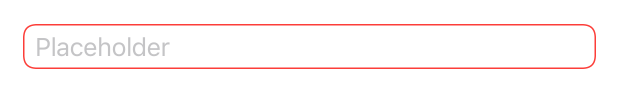 |
Our two
_FSTextFieldvariations.
_FSTextField is a wrapper around SwiftUI's TextField with our app design applied to it:
we define this view with an underscore "_" prefix (_FSTextField) to make it clear that this view shouldn't be used directly but, instead, it's an implementation detail of other views.
If we replace our previous TextField definitions with _FSTextField, this already helps:
in the future, when we want to update the text field corner radius (for example), we will only need to change it within _FSTextField, and all other views will automatically inherit the change.
It should be possible to 3rd party developers to define
TextFieldstyles, FB9078993.
Generic text fields: composable views
Looking at our text fields variations, we can group them into two categories:
- views that have something on top of
_FSTextField(e.g., the title and a glyph) - views that have just
_FSTextFieldand nothing else
Let's define a new generic view that covers both variations, FSTextField:
struct FSTextField<TopContent: View>: View {
  var placeholder: LocalizedStringKey = ""
  @Binding var text: String
  var appearance: Appearance = .default
  var topContent: TopContent

  init(
    placeholder: LocalizedStringKey = "",
    text: Binding<String>,
    appearance: Appearance = .default,
    @ViewBuilder topContent: () -> TopContent
  ) {
    self.placeholder = placeholder
    self._text = text
    self.appearance = appearance
    self.topContent = topContent()
  }

  enum Appearance {
    case `default`
    case error
  }

  var body: some View {
    VStack {
      topContent
      _FSTextField(
        placeholder: placeholder,
        text: $text,
        borderColor: borderColor
      )
    }
  }

  var borderColor: Color {
    switch appearance {
    case .default:
      return .green
    case .error:
      return .red
    }
  }
}
FSTextField is a VStack with a generic TopContent view on top, and our _FSTextField at the bottom.
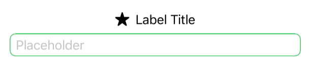
Thanks to this new definition, we can place any view above our _FSTextField. What about a Label, for example?
FSTextField(placeholder: "Placeholder", text: $text) {
  Label("Label Title", systemImage: "star.fill")
}
Lastly, we need to take care of the view variation with no content above _FSTextField. How do we address that?
As VStacks ignore EmptyViews, if we want to display just the _FSTextField and nothing else, we can pass an EmptyView instance as our TopContent:
FSTextField(
  placeholder: "Placeholder",
  text: $myText
) {
  EmptyView()
}
This works because:
- A
VStackwith anEmptyViewand_FSTextFieldis (visually) equivalent to aVStackwith just a_FSTextField - Any stack with just an element is (visually) equivalent to just the element itself
Therefore writing:
var body: some View {
  VStack {
    EmptyView()
    _FSTextField(...)
  }
}
is equivalent to:
var body: some View {
  _FSTextField(...)
}
We're building this design system and we know these tricks/details, however, we cannot expect other developers to have this knowledge as well. To make their life easier, we can create a FSTextField extension that hides this VStack + EmptyView combo:
extension FSTextField where TopContent == EmptyView {
  init(
    placeholder: LocalizedStringKey = "",
    text: Binding<String>,
    appearance: Appearance = .default
  ) {
    self.placeholder = placeholder
    self._text = text
    self.appearance = appearance
    self.topContent = EmptyView()
  }
}
Thanks to this extension, developers that want to display just the text field can now use this new initializer, without the need for them to know how FSTextField is implemented:
FSTextField(placeholder: "Placeholder", text: $myText)
Generic Text Fields: Convenience initializers
All other text field variations have some TopContent to display.
We could stop here and ask the developer to define the content themselves each time, for example:
FSTextField(
  placeholder: "Placeholder",
  text: $myText
) {
  HStack {
    Text(title)
      .bold()
    Spacer()
  }
}
...however, since all these variations have a TopContent with a title-space-something pattern, we can do a little better with a new FSTextField extension:
extension FSTextField {
  init<TopTrailingContent: View>(
    title: LocalizedStringKey,
    placeholder: LocalizedStringKey = "",
    text: Binding<String>,
    appearance: Appearance = .default,
    @ViewBuilder topTrailingContent: () -> TopTrailingContent
  ) where TopContent == HStack<TupleView<(Text, Spacer, TopTrailingContent)>> {
    self.placeholder = placeholder
    self._text = text
    self.appearance = appearance
    self.topContent = {
      HStack {
        Text(title)
          .bold()
        Spacer()
        topTrailingContent()
      }
    }()
  }
}
This new initializer lets developers pass the title text directly as one of the init parameters, and then have the opportunity to define what else is placed on the top trailing corner via the new topTrailingContent parameter.
For example, our old FSMessageTextField can now be obtained with the following code:
FSTextField(
  title: "Title",
  placeholder: "Placeholder",
  text: $text
) {
  Text("Message")
    .font(.caption)
}
As before, in case our developers would like to show just a _FSTextField and a title, they shouldn't need to know that they can pass an EmptyView instance as the topTrailingContent parameter, therefore it's better to create a new extension to take care of this scenario:
extension FSTextField {
  init(
    title: LocalizedStringKey,
    placeholder: LocalizedStringKey = "",
    text: Binding<String>,
    appearance: Appearance = .default
  ) where TopContent == HStack<TupleView<(Text, Spacer, EmptyView)>> {
    self.init(
      title: title,
      placeholder: placeholder,
      text: text,
      appearance: appearance,
      topTrailingContent: EmptyView.init
    )
  }
}
Again, this works because EmptyViews are ignored when placed within stacks.
Thanks to this definition a simple text field + title combo (with no top trailing views) can be obtained via:
FSTextField(title: "Title", placeholder: "Placeholder, text: $myText)
Every other variation that we previously have defined with a new View can now be obtained directly via FSTextField:
when, in the future, the design team decides to update the title font, the title color, or the spacing between top content and _FSTextField for example, we will be able to update such detail in one place, and every other view will inherit the change.
Not only that, but thanks to our generic approach, future variations of our text field component won't require new definitions or changes in our design system.
📚 A sample project with the design system defined in this article can be found here.
Conclusions
Like code, design is never finished:
thanks to Swift and SwiftUI we can build a solid, flexible, and intuitive design system that will help us build, compose, and update entire screens at a pace that wasn't possible before.
SwiftUI itself uses this very same approach on many of its definitions:
Buttons'init(_ titleKey: LocalizedStringKey, action: @escaping () -> Void)is a convenience initializer overinit(action: @escaping () -> Void, label: () -> Label)- lazy stacks are just a specific configuration of lazy grids
- we've also seen how SwiftUI hides optional bindings when they're not needed
Listhas one initializer for each possible use case (e.g., for hierarchy lists)
...and many, many more.
Do your apps have a design system? What other approaches/patterns have you seen/used while building one? Please let me know 😃
Thank you for reading, and stay tuned for more articles!