View masking in SwiftUI
 @zntfdr
📚 This article comes with a companion app! Download it here.
In View clipping in SwiftUI, we've explored all the ways we can apply clipping masks to views (if you haven't already, read that article first). While powerful, clipping has two significant limitations:
- it requires shapes as masks
- the content is either masked or not; there's no gray area
Let's explore SwiftUI masking beyond clipping.
Mask
The last masking view modifier that SwiftUI offers is mask(alignment:_:):
extension View {
  @inlinable public func mask<Mask: View>(
    alignment: Alignment = .center,
    @ViewBuilder _ mask: () -> Mask
  ) -> some View
}
This is a new view modifier using the new view builder pattern. For older OSes, the
maskdeclaration is slightly different, but the same concepts are still applied.
Besides the naming, this modifier declaration is identical to a couple of other view modifiers we're probably very familiar with, overlay(alignment:_:) and background(alignment:_:):
extension View {
  @inlinable public func overlay<V: View>(
    alignment: Alignment = .center,
    @ViewBuilder content: () -> V
  ) -> some View

  @inlinable public func background<V: View>(
    alignment: Alignment = .center,
    @ViewBuilder content: () -> V
  ) -> some View
}
This is not a coincidence. mask(alignment:_:) positions its mask exactly like an overlay or a background modifier would:
- the modifier proposes to its mask the natural size of the view it's applied to
- once the mask size is known, it is placed over the view, according to the specified
alignment
Mask alignment
The alignment parameter is particularly useful when the mask and the original view have different sizes. In the following example, the mask is 30% the size of the view it's applied to:
struct FSView: View {
  private let alignments: [Alignment] = [
    .center, .leading, .trailing, .top, .bottom, .topLeading, .topTrailing, .bottomLeading, .bottomTrailing
  ]
  @State var alignment: Alignment = .center

  var body: some View {
    VStack {
      Color.yellow
        .frame(width: 200, height: 200)
        .mask(alignment: alignment) {
          Rectangle()
            .frame(width: 60, height: 60) // 👈🏻 60 x 60 is smaller than 200x200
        }
        .border(.red)

      Button("Random alignment") {
        withAnimation {
          alignment = alignments.filter { $0 != alignment } .randomElement()!
        }
      }
    }
  }
}
Alignmentshould beCaseIterable(FB9581717)
The red border shows the bound of the original view for a visual aid: otherwise, we'd see just a small rectangle floating around.
Views as masks
The real power over clipping modifiers stands with the opportunity to use any Views as masks. What about Text, for example?
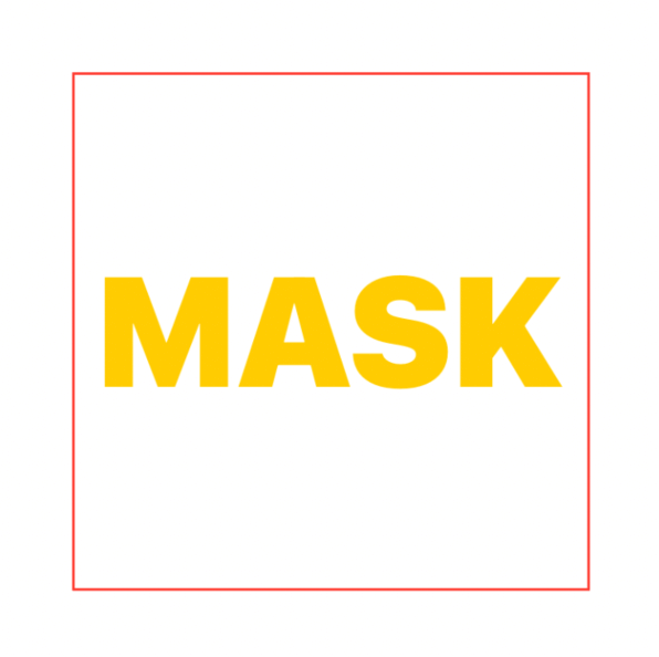
Color.yellow
  .frame(width: 200, height: 200)
  .mask {
    Text("MASK")
      .fontWeight(.black)
      .font(.system(size: 60))
  }
  .border(Color.red)
Unlike shapes, there's no expectation for views to stay within the natural size of the view they're applied to. Therefore masks can allow content bleeding.
In the following example:
- the view content extends to a 300x300 points rectangle
- the view bound is 200x200 points
- the applied mask exceeds the view bounds, allowing content bleeding
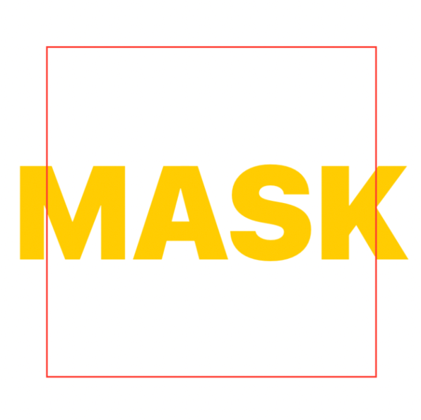
Color.yellow
  .frame(width: 300, height: 300)
  .frame(width: 200, height: 200)
  .mask {
    Text("MASK")
      .fontWeight(.black)
      .font(.system(size: 80))
      .fixedSize() // 👈🏻 Ignores the proposed 200x200 points size
  }
  .border(Color.red)
Opacity
mask(alignment:_:) uses the mask opacity to determine what is shown from the original view, for example:
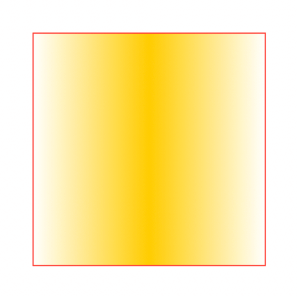
Color.yellow
  .frame(width: 200, height: 200)
  .mask {
    LinearGradient(colors: [.clear, .black, .clear], startPoint: .leading, endPoint: .trailing)
  }
  .border(Color.red)
Here we use a linear gradient with three stops. The gradient color in the middle doesn't matter. It's the color opacity that does:
we could replace it with .white, .red etc. The result would be the same.
While we don't have to use gradients with masks, this fading technique is very popular in iOS.
In the following example we take the sample code from How to control safe area insets in SwiftUI and add a subtle fading effect below the button:
| No effect/mask | Fade effect/mask |
struct ContentView: View {
  var body: some View {
    ScrollView {
      ...
    }
    .safeAreaInset(edge: .bottom) {
      Button { } label: { ... }
        .background {
          Color(uiColor: .systemBackground)
            .mask(alignment: .top) {
              VStack(spacing: 0) {
                LinearGradient(
                  stops: [
                    Gradient.Stop(color: .clear, location: .zero),
                    Gradient.Stop(color: .black, location: 1.0)
                  ],
                  startPoint: .top,
                  endPoint: .bottom
                )
                .frame(height: 32)
                Color.black
              }
            }
            .padding(.top, -32)
            .ignoresSafeArea(.all, edges: .bottom)
        }
    }
  }
}
Blur
Another visually pleasing technique is mixing the fade effect with a blur. To obtain this mix, we need to change just two lines from the example above:
| Fade effect | Fade + Blur effect |
struct ContentView: View {
  var body: some View {
    ...
      .background {
        Color.clear // 👈🏻
          .background(.ultraThinMaterial) // 👈🏻
          .mask(alignment: .top) {
            ...
          }
          ...
      }
    }
  }
}
The complete source code can be found here.
Conclusions
Masking is one of those subtle effects that can help bring our app design to the next level.
So far, we've covered what SwiftUI offers: in the next and final article of the series, we will explore what we can do beyond the official APIs.
If you haven't already, this is a very good time to subscribe to Five Star's RSS feed. Thank you for reading!