A TextFieldStyle API preview!
 @zntfdr
Recently we've covered four different ways to customize TextFields:
ideally we wouldn't have to choose, as SwiftUI's official way to customize components is by using and creating associated styles.
While TextFieldStyle's requirements are not public yet, we can take a sneak peek under the hood and guess at how an official API might look like: in this article, let's do just that!
This article's code works, however please do consider it experimental and do not use it in production. As always, I have no insights on what the SwiftUI team is working on. This is entirely speculation with no inside knowledge.
TextFieldStyle
Here's the current internal TextFieldStye declaration (as of Xcode 12.5):
public protocol TextFieldStyle {
  associatedtype _Body: View
  @ViewBuilder func _body(configuration: TextField<Self._Label>) -> Self._Body
  typealias _Label = _TextFieldStyleLabel
}
Beside a small difference in the typealias this declaration closely follows all other public styles.
As a reminder/comparison here are the public style requirements for Button and Label:
public protocol ButtonStyle {
  associatedtype Body: View
  @ViewBuilder func makeBody(configuration: Self.Configuration) -> Self.Body
  typealias Configuration = ButtonStyleConfiguration
}

public protocol LabelStyle {
  associatedtype Body: View
  func makeBody(configuration: Self.Configuration) -> Self.Body
  typealias Configuration = LabelStyleConfiguration
}
We have dedicated articles to both styles in Exploring SwiftUI's Button styles and Label.
All these requirements come with a configuration, which dictates what we can achieve on the associated style. Let's have a look at that next.
TextFieldStyleConfiguration
The current TextFieldStyle configuration is a TextField instance, TextField<Self._Label>:
@ViewBuilder func _body(configuration: TextField<Self._Label>) -> Self._Body
It might be surprising that TextField has an associated generic type, if we look at the official declaration, we see that this is indeed true, however as of today, TextField only exposes init methods where Label == Text.
public struct TextField<Label: View>: View {
  public var body: some View { get }
  public typealias Body = some View
}

extension TextField where Label == Text {
  public init(
  	_ titleKey: LocalizedStringKey,
  	text: Binding<String>,
  	onEditingChanged: @escaping (Bool) -> Void = { _ in },
  	onCommit: @escaping () -> Void = {}
  )

  ...
}
Label represents the placeholder view: we will probably have more flexibility once SwiftUI drops UITextField and have its own independent implementation.
Using the same technique from Inspecting SwiftUI views, we can see what kind of details a TextFieldStyle configuration has:
struct ContentView: View {
  @State var text = "FIVE STARS"

  var body: some View {
    TextField(
      "type something...",
      text: $text
    )
    .textFieldStyle(InspectStyle())
  }
}

struct InspectStyle: TextFieldStyle {
  @ViewBuilder
  func _body(configuration: TextField<_Label>) -> some View {
    let _ = print(configuration)
    configuration
  }
}
InspectStyle returns the configuration as is, just after letting us take a peek to what it looks like:
TextField<_TextFieldStyleLabel>(
  text: Binding<String>,
  isSecure: Bool,
  label: _TextFieldStyleLabel,
  onEditingChanged: (Bool) -> (),
  onCommit: () -> (),
  updatesContinuously: Bool,
  uncommittedText: State<Optional<String>>
)
Formatted and simplified for clarity's sake.
Most of what we see is expected, with a few exceptions:
text,onEditingChanged, andonCommitare the same parameters we pass toTextField'sinitisSecuretells us whether we're applying our style to aTextFieldor aSecureFieldlabelis our placeholder viewupdatesContinuouslyanduncommittedTextare implementation details (if you have any information on these, please let me know!)
isSecure is very interesting:
currently, if we'd like to swap between TextField and a SecureField, we'd need to replace the field with its counterpart. However, adding/replacing/removing views is frowned upon since it's one of the easiest ways to drop performance in SwiftUI.
Hopefully SecureField will get deprecated, and this isSecure property will be exposed as part of the TextField initializers instead (FB8947595).
Playing with TextFieldStyle's Configuration
Now that we've seen how the configuration looks like, we can use it as we please.
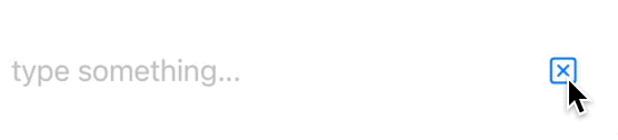
What about creating a style that adds a clear button?
struct ContentView: View {
  @State var text = "FIVE STARS"

  var body: some View {
    TextField(
      "type something...",
      text: $text
    )
    .textFieldStyle(ClearStyle())
  }
}

struct ClearStyle: TextFieldStyle {
  @ViewBuilder
  func _body(configuration: TextField<_Label>) -> some View {
    let mirror = Mirror(reflecting: configuration)
    let text: Binding<String> = mirror.descendant("_text") as! Binding<String>
    configuration
      .overlay(
        Button { text.wrappedValue = "" } label: { Image(systemName: "clear") }
          .padding(),
        alignment: .trailing
      )
  }
}
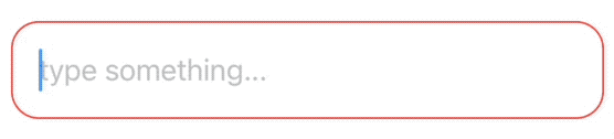
Or maybe we'd like to have different visuals based on whether our text fields requirements are met:
struct ContentView: View {
  @State var text = "FIVE STARS"

  var body: some View {
    TextField(
      "type something...",
      text: $text
    )
    .textFieldStyle(RequirementStyle())
  }
}

struct RequirementStyle: TextFieldStyle {
  @ViewBuilder
  func _body(configuration: TextField<_Label>) -> some View {
    let mirror = Mirror(reflecting: configuration)
    let text: String = mirror.descendant("_text", "_value") as! String
    configuration
      .padding()
      .background(
        RoundedRectangle(cornerRadius: 16)
          .strokeBorder(text.count > 3 ? Color.green : Color.red)
      )
  }
}
We can also be mischievous and call onEditingChanged or onCommit at will:
struct DeceiveStyle: TextFieldStyle {
  @ViewBuilder
  func _body(configuration: TextField<_Label>) -> some View {
    let mirror = Mirror(reflecting: configuration)
    let onCommit: () -> Void = mirror.descendant("onCommit") as! () -> Void

    VStack {
      configuration
      Button("Trigger onCommit event", action: onCommit)
    }
  }
}
A limitation of this approach is that we can't subscribe our style to the onEditingChanged or onCommit events. This will probably be possible once the official APIs are public, maybe with a new TextField initializer accepting a TextFieldConfiguration along with two optional onEditingChanged or onCommit blocks.
A preview
So far we've played with our knowledge from InspectStyle and reached for each property by using Swift's Mirror: this works great.
Still, it's cumbersome to do so for every style we might define, instead, let's recreate a new TextFieldStyle that makes it easy to access all these properties.
First let's define our own configuration (we use P as suffix for "preview"):
struct TextFieldStyleConfigurationP<Label: View> {
  /// The text to display and edit.
  @Binding var text: String

  /// Whether the text should be private (visible) or not.
  let isSecure: Bool

  /// A type-erased TextField.
  let label: Label

  /// The placeholder view.
  let placeholder: _TextFieldStyleLabel

  ///  The action to perform when the user begins editing
  ///  `text` and after the user finishes editing `text`.
  let onEditingChanged: (Bool) -> Void

  /// The action to perform when the user hit the return key.
  let onCommit: () -> Void

  /// (???)
  let updatesContinuously: Bool

  /// (???)
  @State var uncommittedText: String?
}
Then our style:
protocol TextFieldStyleP {
  associatedtype Body: View
  typealias _Label = TextField<_TextFieldStyleLabel>
  @ViewBuilder func makeBody(configuration: TextFieldStyleConfigurationP<_Label>) -> Self.Body
}
At this point we need to bridge SwiftUI's text styles with our new one. Instead of reinventing the wheel, we can piggyback on SwiftUI's TextFieldStyle with the following PreviewBridgeStyle:
struct PreviewBridgeStyle<Style: TextFieldStyleP>: TextFieldStyle {
  let style: Style

  @ViewBuilder
  func _body(configuration: TextField<_Label>) -> some View {
    let mirror = Mirror(reflecting: configuration)
    let text: Binding<String> = mirror.descendant("_text") as! Binding<String>
    let isSecure: Bool = mirror.descendant("isSecure") as! Bool
    let label: _TextFieldStyleLabel = mirror.descendant("label") as! _TextFieldStyleLabel
    let onEditingChanged: (Bool) -> Void = mirror.descendant("onEditingChanged") as! (Bool) -> Void
    let onCommit: () -> Void = mirror.descendant("onCommit") as! () -> Void
    let updatesContinuously: Bool = mirror.descendant("updatesContinuously") as! Bool
    let uncommittedText: State<String?> = mirror.descendant("_uncommittedText") as! State<String?>

    let textStyleConfiguration = TextFieldStyleConfigurationP(
      text: text,
      isSecure: isSecure,
      label: configuration,
      placeholder: label,
      onEditingChanged: onEditingChanged,
      onCommit: onCommit,
      updatesContinuously: updatesContinuously,
      uncommittedText: uncommittedText.wrappedValue
    )

    style.makeBody(configuration: textStyleConfiguration)
  }
}
PreviewBridgeStyle is a TextFieldStyle that extracts our TextFieldStyleConfigurationP and passes it to our TextFieldStyleP.
Lastly we define the following View extension:
extension View {
  func textFieldStyleP<S: TextFieldStyleP>(_ style: S) -> some View {
    textFieldStyle(PreviewBridgeStyle(style: style))
  }
}
Which will do the transformation for us. From now on, we can define our styles with all the data immediately available.
Here's the ClearStyle again with this new approach:
struct ContentView: View {
  @State var text = "FIVE STARS"

  var body: some View {
      TextField(
        "type something...",
        text: $text
      )
      .textFieldStyleP(ClearStyleP())
      // note the P suffixes
  }
}

struct ClearStyleP: TextFieldStyleP {
  func makeBody(configuration: TextFieldStyleConfigurationP<_Label>) -> some View {
    configuration
      .label
      .overlay(
        Button { configuration.text = "" } label: { Image(systemName: "clear") }
          .padding(),
        alignment: .trailing
      )
  }
}
And here's the RequirementStyle:
struct ContentView: View {
  @State var text = "FIVE STARS"

  var body: some View {
    TextField(
      "type something...",
      text: $text
    )
    .textFieldStyleP(RequirementStyleP())
  }
}

struct RequirementStyleP: TextFieldStyleP {
  func makeBody(configuration: TextFieldStyleConfigurationP<_Label>) -> some View {
    configuration
      .label
      .padding()
      .background(
        RoundedRectangle(cornerRadius: 16)
          .strokeBorder(configuration.text.count > 3 ? Color.green : Color.red)
      )
  }
}
In about one month (WWDC21!), we might get a similar official API:
it might be possible to use the approach above for retro compatibility (hopefully with just minor changes).
Conclusions
In this article we've explored what the future of TextField (and SecureField) might look like:
there are big expectations around this component for this year's WWDC, especially on aspects such as first responder control (FB9081556), June can't come soon enough!
What else are you looking forward to at WWDC21? Please let me know via twitter or email.