Meet the new Button styling
 @zntfdr
One of the most powerful SwiftUI aspects is customization. We can create, and iterate on, views at a quick pace. The best part? We don't have to declare the whole design in the view: instead, we can embrace SwiftUI's styles.
This year Buttons has gained new powerful customization tools; Let's see how we can take advantage of them in our styles.
Groundwork
This article assumes some knowledge on SwiftUI buttons and styles in general:
- for an overview of what's new this year, see The many faces of button in SwiftUI by Majid Jabrayilov
- for a deep dive into
Buttonstyling, see Exploring SwiftUI's Button styles - for a guide on how to create styles for custom views, see Custom SwiftUI view styles
Meet FiveStarsButtonStyle
We're going to create our own button style that takes advantage of all the new Xcode 13 features, meet FiveStarsButtonStyle:
struct FiveStarsButtonStyle: ButtonStyle {
  func makeBody(configuration: Configuration) -> some View {
    configuration
      .label
      .opacity(configuration.isPressed ? 0.5 : 1)
  }
}
What's new in SwiftUI told us that there's a new way to apply styles:
- the old approach, e.g.
Button(...).buttonStyle(PlainButtonStyle()), has been deprecated - the new approach, e.g.
Button(...).buttonStyle(.plain), is more succinct and to the point
Let's make it possible to use our style with the new API:
extension ButtonStyle where Self == FiveStarsButtonStyle {
  static var fiveStars: FiveStarsButtonStyle {
    FiveStarsButtonStyle()
  }
}
Great! We can now apply our style like any other, with the new modern API:
Button("Tap me") {
  ...
}
.buttonStyle(.fiveStars)

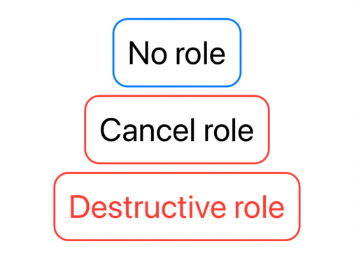
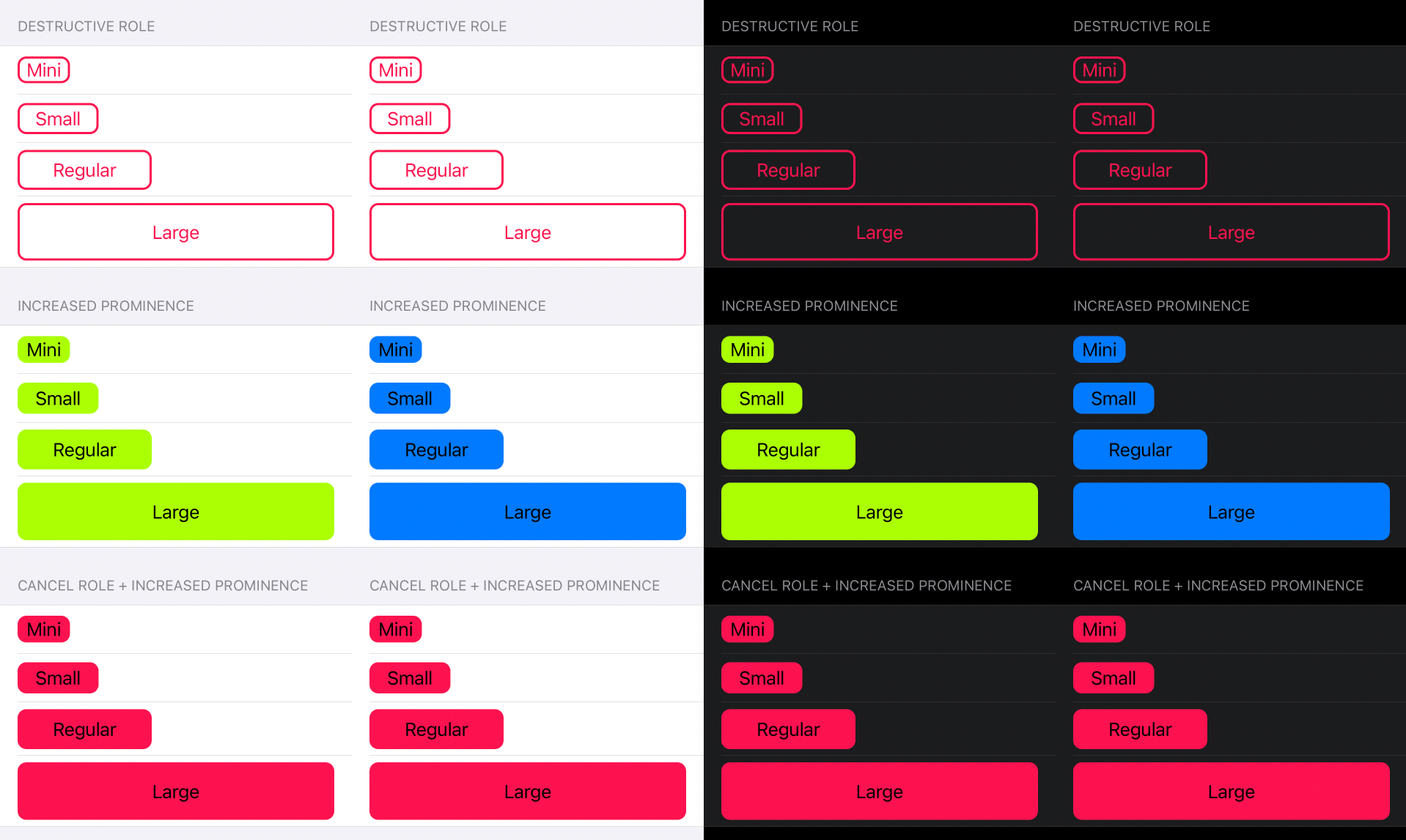
Roles
From this year, buttons can be associated with a ButtonRole. Like Button's title and action, role is assigned via parameter instead of being passed down via the environment. Here are all the possible values (as of Xcode 13b2):
Button("No role", role: nil) { ... } // default, equivalent to Button("No role") { ... }
Button("Cancel role", role: .cancel) { ... }
Button("Destructive role", role: .destructive) { ... }
We can take advantage of this role in our style via the new ButtonStyleConfiguration role property:
public struct ButtonStyleConfiguration {
  public let role: ButtonRole? // 👈🏻
  public let label: ButtonStyleConfiguration.Label
  public let isPressed: Bool
}
roleis the first property that has been added to bothButtonStyleConfigurationandPrimitiveButtonStyleConfigurationsince their launch.
For example:
struct FiveStarsButtonStyle: ButtonStyle {
  func makeBody(configuration: Configuration) -> some View {
    configuration
      .label
      .padding(.horizontal)
      .padding(.vertical)
      .foregroundColor(foregroundColor(for: configuration.role))
      .background {
        RoundedRectangle(cornerRadius: 8)
          .strokeBorder(color(for: configuration.role), lineWidth: 2)
      }
      .opacity(configuration.isPressed ? 0.5 : 1)
  }

  func foregroundColor(for role: ButtonRole?) -> Color? {
    role == .destructive ? .red : nil
  }

  func color(for role: ButtonRole?) -> Color {
    switch role {
      case .cancel?, .destructive?:
        return Color.red
      default:
        return Color.accentColor
    }
  }
}
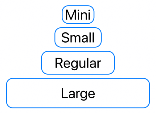
Control size
From Xcode 13 we also have the possibility to declare the size of our controls, this is done via a new controlSize(_:) modifier:
Button("Mini") { ... }
  .controlSize(.mini)
Button("Small") { ... }
  .controlSize(.small)
Button("Regular") { ... }
  .controlSize(.regular) // default
Button("Large") { ... }
  .controlSize(.large)
The ControlSize value is then passed down through the environment, which we can read and use in our style:
struct FiveStarsButtonStyle: ButtonStyle {
  @Environment(\.controlSize) var controlSize: ControlSize // 👈🏻

  func makeBody(configuration: Configuration) -> some View {
    configuration
      .label
      .frame(maxWidth: controlSize == .large ? .infinity : nil)
      .padding(.horizontal, horizontalPadding)
      .padding(.vertical, verticalPadding)
      .foregroundColor(foregroundColor(for: configuration.role))
      .background {
        RoundedRectangle(cornerRadius: 8)
          .strokeBorder(color(for: configuration.role), lineWidth: 2)
      }
      .opacity(configuration.isPressed ? 0.5 : 1)
  }

  var horizontalPadding: Double {
    switch controlSize {
      case .mini:
        return 8
      case .small:
        return 16
      case .regular:
        return 32
      case .large:
        return 0 // no need.
      @unknown default:
        return 0
    }
  }

  var verticalPadding: Double {
    switch controlSize {
      case .mini:
        return 2
      case .small:
        return 4
      case .regular:
        return 8
      case .large:
        return 16
      @unknown default:
        return 0
    }
  }

  func foregroundColor(for role: ButtonRole?) -> Color? {
    ...
  }

  func color(for role: ButtonRole?) -> Color {
    ...
  }
}
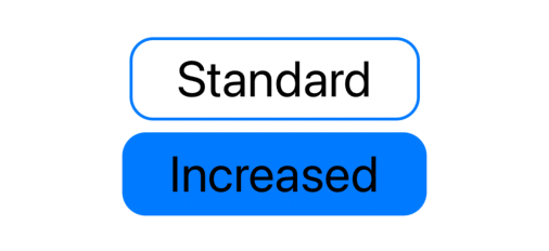
Control prominence
Similar to control size, we also have control prominence, which lets us further emphasize/highlight our buttons:
Button("Standard") { ... }
  .controlProminence(.standard) // default
Button("Increased") { ... }
  .controlProminence(.increased)
We use the environment to retrieve the Prominence value:
struct FiveStarsButtonStyle: ButtonStyle {
  @Environment(\.controlSize) var controlSize: ControlSize
  @Environment(\.controlProminence) var controlProminence: Prominence // 👈🏻

  func makeBody(configuration: Configuration) -> some View {
    configuration
      .label
      .frame(maxWidth: controlSize == .large ? .infinity : nil)
      .padding(.horizontal, horizontalPadding)
      .padding(.vertical, verticalPadding)
      .foregroundColor(foregroundColor(for: configuration.role))
      .background {
        backgroundColor(for: configuration.role).cornerRadius(8)
        if let borderColor = borderColor(for: configuration.role) {
          RoundedRectangle(cornerRadius: 8)
            .strokeBorder(borderColor, lineWidth: 2)
        }
      }
      .opacity(configuration.isPressed ? 0.5 : 1)
  }

  var horizontalPadding: Double {
    ...
  }

  var verticalPadding: Double {
    ...
  }

  func foregroundColor(for role: ButtonRole?) -> Color? {
    switch (controlProminence, role) {
      case (.standard, .destructive?):
        return .red
      case (.increased, .destructive?):
        return .white
      case (.increased, _):
        return .black
      case (_, _):
        return nil
    }
  }

  func backgroundColor(for role: ButtonRole?) -> Color? {
    switch controlProminence {
      case .increased:
        return color(for: role)
      case .standard:
        fallthrough
      @unknown default:
        return nil
    }
  }

  func color(for role: ButtonRole?) -> Color {
    switch role {
      case .cancel?, .destructive?:
        return Color.red
      default:
        return Color.accentColor
    }
  }

  func borderColor(for role: ButtonRole?) -> Color? {
    switch controlProminence {
      case .standard:
        return color(for: role)
      case .increased:
        fallthrough
      @unknown default:
        return nil
    }
  }
}
Passing parameters
With the old API, it was easy to pass parameters to our styles. Let's say that we want to add a cornerRadius parameter to our style, to be used for the round corners:
struct FiveStarsButtonStyle: ButtonStyle {
  let cornerRadius: Double
  ...
}
With our new modern declaration, this is not possible:
extension ButtonStyle where Self == FiveStarsButtonStyle {
  static var fiveStars: FiveStarsButtonStyle {
    FiveStarsButtonStyle() // 👈🏻 we need to pass our cornerRadius here
  }
}
However, no body forbids us to further expand this extension and declare a static function:
extension ButtonStyle where Self == FiveStarsButtonStyle {
  static func fiveStars(cornerRadius: Double = 8) -> FiveStarsButtonStyle {
    FiveStarsButtonStyle(cornerRadius: cornerRadius)
  }
}
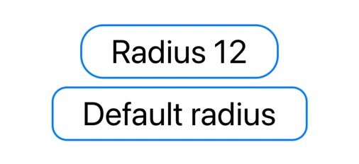
Which we can use as following:
Button("Radius 12") {
  ...
}
.buttonStyle(.fiveStars(cornerRadius: 12))

Button("Default radius") {
  ...
}
.buttonStyle(.fiveStars())
Since we have a default value, we can even keep the original static property:
extension ButtonStyle where Self == FiveStarsButtonStyle {
  static func fiveStars(cornerRadius: Double = 8) -> FiveStarsButtonStyle {
    FiveStarsButtonStyle(cornerRadius: cornerRadius)
  }

  static var fiveStars: FiveStarsButtonStyle {
    fiveStars()
  }
}
Which lets us use the more compact API when we want to use the default behavior:
Button("Tap me") {
  ...
}
.buttonStyle(.fiveStars(cornerRadius: 12))

Button("Tap me") {
  ...
}
.buttonStyle(.fiveStars) // 👈🏻
An alternative approach is to use environment values, in FiveStarsButtonStyle we're using Color.accentColor for example, if we'd like to change that value, we can do so via the accentColor(_:) modifier:
Button("Default accent") {
  ...
}
.buttonStyle(.fiveStars)
.controlProminence(.increased)

Button("Purple accent") {
  ...
}
.buttonStyle(.fiveStars)
.accentColor(.purple) // 👈🏻
.controlProminence(.increased)
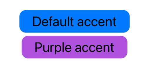
.accentColor(_:)has been deprecated in favor of the newtint(_:)modifier. However, as of Xcode 13b2, it doesn't work as expected (FB9248929).
Etcetera
So far, FiveStarsButtonStyle only considers the new Xcode 13 SwiftUI additions. However, there's more that we can take care of, such as dynamic types, isEnabled state, platform-specific styles, etc.
Reminder: just because we have these powerful tools at our disposal, it doesn't mean that we have to support them all in our apps/styles. Add support to what makes sense to your product(s).
A more complete example is available here.
Conclusions
We built a reasonably advanced style with dynamics based on the button definition, environment values, etc. However, when it's time to use it, all we have to do is call .buttonStyle(.fiveStars).
This whole complexity becomes an implementation detail hidden behind a style name: developers using our style don't need to worry about any of that, and the goal is beautifully achieved thanks to SwiftUI styles.
Do you use custom styles in your apps? Are you going to take advantage of the new roles and control properties? Let me know via email or Twitter!
This article is part of a series exploring new SwiftUI features. We will cover many more during the rest of the summer: subscribe to Five Stars's feed RSS or follow @FiveStarsBlog on Twitter to never miss new content!