Four ways to customize TextFields
 @zntfdr
SwiftUI is a dream for prototyping and building views: in this article, let’s see how we can customize a TextField.
TextFieldStyle
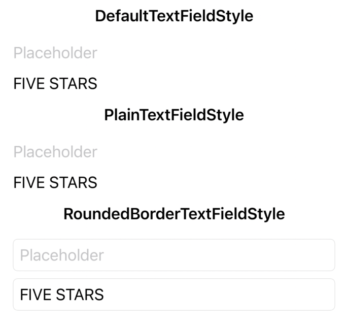
Before thinking about customization, we should consider what SwiftUI offers. TextField comes with its own style which, despite not allowing creating our own (FB9078993), presents us some options:
DefaultTextFieldStylePlainTextFieldStyleRoundedBorderTextFieldStyle
VStack {
  Section(header: Text("DefaultTextFieldStyle").font(.headline)) {
    TextField("Placeholder", text: .constant(""))
    TextField("Placeholder", text: $text)
  }
  .textFieldStyle(DefaultTextFieldStyle())

  Section(header: Text("PlainTextFieldStyle").font(.headline)) {
    TextField("Placeholder", text: .constant(""))
    TextField("Placeholder", text: $text)
  }
  .textFieldStyle(PlainTextFieldStyle())

  Section(header: Text("RoundedBorderTextFieldStyle").font(.headline)) {
    TextField("Placeholder", text: .constant(""))
    TextField("Placeholder", text: $text)
  }
  .textFieldStyle(RoundedBorderTextFieldStyle())
}
DefaultTextFieldStyle is applied to all TextFields where no different style has been set. In iOS, this matches applying the PlainTextFieldStyle.
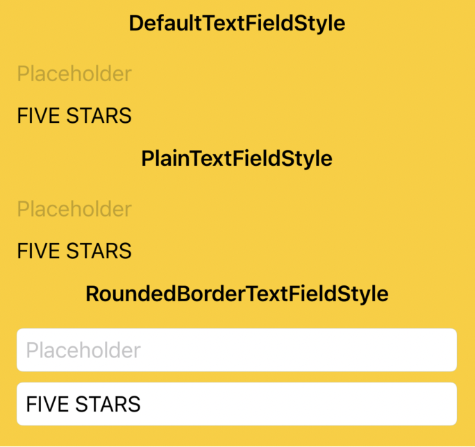
The difference between PlainTextFieldStyle RoundedBorderTextFieldStyle seems to be just the presence of a rounded corner border, however a TextField with RoundedBorderTextFieldStyle also comes with a white/black background (depending on the environment appearance), while a TextField with PlainTextFieldStyle is transparent:
VStack {
  Section(header: Text("DefaultTextFieldStyle").font(.headline)) {
    TextField("Placeholder", text: .constant(""))
    TextField("Placeholder", text: $text)
  }
  .textFieldStyle(DefaultTextFieldStyle())

  Section(header: Text("PlainTextFieldStyle").font(.headline)) {
    TextField("Placeholder", text: .constant(""))
    TextField("Placeholder", text: $text)
  }
  .textFieldStyle(PlainTextFieldStyle())

  Section(header: Text("RoundedBorderTextFieldStyle").font(.headline)) {
    TextField("Placeholder", text: .constant(""))
    TextField("Placeholder", text: $text)
  }
  .textFieldStyle(RoundedBorderTextFieldStyle())
}
.background(Color.yellow)
This is all we have. Let’s talk about customization next.
The SwiftUI way (part 1)
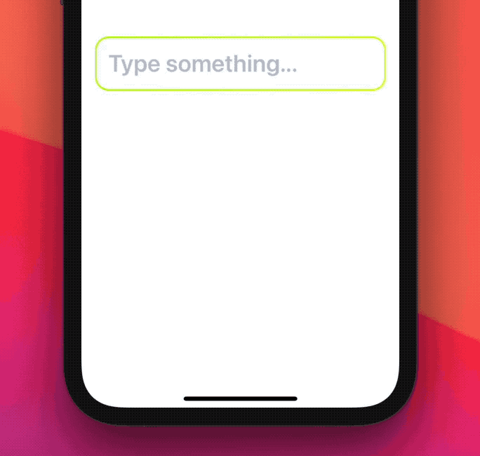
Since there’s no public API to create new TextField styles at this time, the recommended way to customize TextFields is to wrap TextField in our definitions, similarly to what we did in Composing SwiftUI views:
public struct FSTextField: View {
  var titleKey: LocalizedStringKey
  @Binding var text: String

  /// Whether the user is focused on this `TextField`.
  @State private var isEditing: Bool = false

  public init(_ titleKey: LocalizedStringKey, text: Binding<String>) {
    self.titleKey = titleKey
    self._text = text
  }

  public var body: some View {
    TextField(titleKey, text: $text, onEditingChanged: { isEditing = $0 })
      // Make sure no other style is mistakenly applied.
      .textFieldStyle(PlainTextFieldStyle())
      // Text alignment.
      .multilineTextAlignment(.leading)
      // Cursor color.
      .accentColor(.pink)
      // Text color.
      .foregroundColor(.blue)
      // Text/placeholder font.
      .font(.title.weight(.semibold))
      // TextField spacing.
      .padding(.vertical, 12)
      .padding(.horizontal, 16)
      // TextField border.
      .background(border)
  }

  var border: some View {
    RoundedRectangle(cornerRadius: 16)
      .strokeBorder(
        LinearGradient(
          gradient: .init(
            colors: [
              Color(red: 163 / 255.0, green: 243 / 255.0, blue: 7 / 255.0),
              Color(red: 226 / 255.0, green: 247 / 255.0, blue: 5 / 255.0)
            ]
          ),
          startPoint: .topLeading,
          endPoint: .bottomTrailing
        ),
        lineWidth: isEditing ? 4 : 2
      )
  }
}
This is all we can officially customize in a TextField for now. There’s no way to change the placeholder text color, or have different fonts for the text and its placeholder (FB9079255):
we can work around some limitations by using external Texts or even applying masks to TextField while tracking its states, however we would enter in the “hack” territory pretty fast.
Other
TextFields aspects that we can customize that are not strictly UI-related: theTextFieldassociated keyboard type, content type, auto capitalization, and auto correction.
The SwiftUI way (part 2)
When TextField doesn’t meet our needs, we can always fall back to UIKit’s UITextField. While it might not always be ideal, it doesn’t take too much to create a dedicated UIViewRepresentable:
struct UIKitTextField: UIViewRepresentable {
  var titleKey: String
  @Binding var text: String

  public init(_ titleKey: String, text: Binding<String>) {
    self.titleKey = titleKey
    self._text = text
  }

  func makeUIView(context: Context) -> UITextField {
    let textField = UITextField(frame: .zero)
    textField.delegate = context.coordinator
    textField.setContentHuggingPriority(.defaultHigh, for: .vertical)
    textField.setContentCompressionResistancePriority(.defaultLow, for: .horizontal)
    textField.placeholder = NSLocalizedString(titleKey, comment: "")

    return textField
  }

  func updateUIView(_ uiView: UITextField, context: Context) {
    if text != uiView.text {
        uiView.text = text
    }
  }

  func makeCoordinator() -> Coordinator {
    Coordinator(self)
  }

  final class Coordinator: NSObject, UITextFieldDelegate {
    var parent: UIKitTextField

    init(_ textField: UIKitTextField) {
      self.parent = textField
    }

    func textFieldDidChangeSelection(_ textField: UITextField) {
      guard textField.markedTextRange == nil, parent.text != textField.text else {
        return
      }
      parent.text = textField.text ?? ""
    }

    func textFieldShouldReturn(_ textField: UITextField) -> Bool {
      textField.resignFirstResponder()
      return true
    }
  }
}
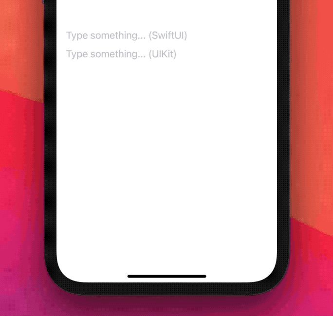
And here it is compared to SwiftUI's TextField:
struct ContentView: View {
  @State var text = ""

  var body: some View {
    VStack {
      TextField("Type something... (SwiftUI)", text: $text)
      UIKitTextField("Type something... (UIKit)", text: $text)
    }
  }
}
Once we have this base text field, we can go ahead and grab all the UIKit functionality that we need, for example changing the placeholder text color is now a matter of adding the following code in UIKitTextField's makeUIView(context:) method:
textField.attributedPlaceholder = NSAttributedString(
  string: NSLocalizedString(titleKey, comment: ""),
  attributes: [.foregroundColor: UIColor.red]
)

With UIKit at our disposal, we can do much more than just simple customizations. For example, we can associate date/picker keyboard types to our text fields, both of which are not supported in SwiftUI (FB9079186 and FB9079187). More importantly, we can make any text field become/resign first responder (FB9081556).
For an advanced
TextFieldUIViewRepresentableexample, I recommend to check out SwiftUIX'sCocoaTextField.
The introspect way
Despite SwiftUI APIs being very different from their UIKit counterparts, oftentimes UIKit is still used behind the scenes.
As of iOS 14 this is still true for TextField, which uses UITextField under the hood:
keeping this in mind, we could traverse TextField’s UIKit hierarchy and look for the associated UITextField.
This is precisely what the Introspect for SwiftUI library does, allowing us to reach for the UIKit counterparts of our SwiftUI views, thus letting us unlock UIKit’s power/control without having to create our own UIViewRepresentable:
import Introspect

struct ContentView: View {
  @State var text = ""

  var body: some View {
    TextField("Type something...", text: $text)
      .introspectTextField { textField in
        // this method will be called with our view's UITextField (if found)
        ...
      }
  }
}
As an example, SwiftUI doesn’t have a way to associate a tool bar to a given text field (FB9081641), we can use Introspect to patch that:
struct ContentView: View {
  @State var text = ""

  var body: some View {
    TextField("Type something...", text: $text)
      .introspectTextField(customize: addToolbar)
  }

  func addToolbar(to textField: UITextField) {
    let toolBar = UIToolbar(
      frame: CGRect(
        origin: .zero,
        size: CGSize(width: textField.frame.size.width, height: 44)
      )
    )
    let flexButton = UIBarButtonItem(
      barButtonSystemItem: UIBarButtonItem.SystemItem.flexibleSpace,
      target: nil,
      action: nil
    )
    let doneButton = UIBarButtonItem(
      title: "Done",
      style: .done,
      target: self,
      action: #selector(textField.didTapDoneButton(_:))
    )
    toolBar.setItems([flexButton, doneButton], animated: true)
    textField.inputAccessoryView = toolBar
  }
}

extension  UITextField {
  @objc func didTapDoneButton(_ button: UIBarButtonItem) -> Void {
    resignFirstResponder()
  }
}
Over 20 lines for a
Donebutton!
While this approach works today, it’s not guaranteed to work in future iOS releases, as we’re relying on SwiftUI’s private implementation details.
With that being said, using Introspect is safe: when SwiftUI’s TextField will no longer use UITextField, our customization method (addToolbar(to:) in the example above) will not be called.
The TextFieldStyle way
At the beginning of the article it’s mentioned how SwiftUI doesn’t allow us to create our own `TextFieldStyle’s yet.
As of Xcode 12.5, this is the complete TextFieldStyle declaration:
/// A specification for the appearance and interaction of a text field.
@available(iOS 13.0, macOS 10.15, tvOS 13.0, watchOS 6.0, *)
public protocol TextFieldStyle {

}
However it's actually possible to create our own style via a "hidden" _body method, therefore we could think about the actual TextFieldStyle declaration as following:
public protocol TextFieldStyle {
  associatedtype _Body: View
  @ViewBuilder func _body(configuration: TextField<Self._Label>) -> Self._Body
  typealias _Label = _TextFieldStyleLabel
}
...making it possible to create our own styles:
struct FSTextFieldStyle: TextFieldStyle {
  func _body(configuration: TextField<_Label>) -> some View {
     //
  }
}
Here's how we could replace our previous FSTextField declaration with a new FSTextFieldStyle:
struct ContentView: View {
  @State var text = ""

  /// Whether the user is focused on this `TextField`.
  @State private var isEditing: Bool = false

  var body: some View {
    TextField("Type something...", text: $text, onEditingChanged: { isEditing = $0 })
      .textFieldStyle(FSTextFieldStyle(isEditing: isEditing))
  }
}

struct FSTextFieldStyle: TextFieldStyle {
  /// Whether the user is focused on this `TextField`.
  var isEditing: Bool

  func _body(configuration: TextField<_Label>) -> some View {
    configuration
      .textFieldStyle(PlainTextFieldStyle())
      .multilineTextAlignment(.leading)
      .accentColor(.pink)
      .foregroundColor(.blue)
      .font(.title.weight(.semibold))
      .padding(.vertical, 12)
      .padding(.horizontal, 16)
      .background(border)
  }

  var border: some View {
    RoundedRectangle(cornerRadius: 16)
      .strokeBorder(
        LinearGradient(
          gradient: .init(
            colors: [
              Color(red: 163 / 255.0, green: 243 / 255.0, blue: 7 / 255.0),
              Color(red: 226 / 255.0, green: 247 / 255.0, blue: 5 / 255.0)
            ]
          ),
          startPoint: .topLeading,
          endPoint: .bottomTrailing
        ),
        lineWidth: isEditing ? 4 : 2
      )
  }
}
Unfortunately, this approach uses private API, making it unsafe to use: hopefully, we will get an official API soon (FB9078993).
Conclusions
SwiftUI lets us design views at a breakneck speed: when SwiftUI alone doesn’t meet all our needs, there are multiple alternatives out there that we can reach for.
In this article we’ve covered four different ways to customize a TextField, but the same can be applied to many other SwiftUI components. Do you use any of these methods? Do you use something else altogether? Feel free to reach out and let me know via email or twitter!