What's new in SwiftUI
 @zntfdr
WWDC21 is here! SwiftUI has taken another huge step forward, and it comes with many enhancements to current views, new views, new types, new view modifiers, and more:
don't fret! We have a whole summer ahead of us to explore all of that, in this first article, let's have a look at some of the new changes!
For the new "flagship" SwiftUI features, I recommend this article by Majid Jabrayilov.
Colors
New colors
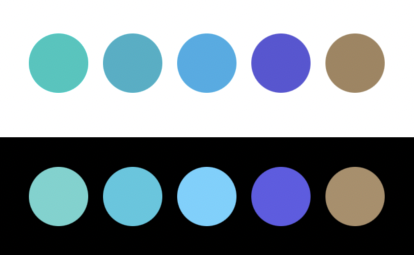
Not all new features need to come with disrupting changes, for example, this year we gained five new colors:
HStack {
  Group {
    Circle()
      .fill(.mint)
    Circle()
      .fill(.teal)
    Circle()
      .fill(.cyan)
    Circle()
      .fill(.indigo)
    Circle()
      .fill(.brown)
  }
  .frame(width: 32, height: 32)
}
New initializers
All current CGColor/UIColor/NSColor Color initializers have been soft deprecated, in favor of new initializers with explicit argument labels:
@available(
  ..., deprecated: ...,
  message: "Use Color(uiColor:) when converting a UIColor, or create a standard Color directly"
)
extension Color {
  public init(_ color: UIColor)
}

@available(iOS 15.0)
extension Color {
  public init(uiColor: UIColor)
}
Styles
New (iOS) Button style
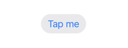
iOS's Button gains BorderedButtonStyle, which previously was available in all other platforms but iOS.
Button("Tap me") {}
  .buttonStyle(BorderedButtonStyle())
New Toggle style
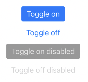
Toggle also gains a new style, available on both macOS and iOS:
VStack {
  Toggle(isOn: .constant(true), label: { Text("Toggle on")})
  Toggle(isOn: .constant(false), label: { Text("Toggle off")})
  Toggle(isOn: .constant(true), label: { Text("Toggle on disabled")})
    .disabled(true)
  Toggle(isOn: .constant(false), label: { Text("Toggle off disabled")})
    .disabled(true)
}
.toggleStyle(ButtonToggleStyle())
New way to apply styles
Beside actual styles, there's a new way to declare which style we'd like to apply, let's take a plain button style for example:
Button("Tap me") {}
  .buttonStyle(PlainButtonStyle())
We can now apply this style with a more succinct API:
Button("Tap me") {}
  .buttonStyle(.plain)
The old way is soft deprecated, and will trigger warnings in future Xcode releases.
This is a nice shift, and it's applied to all SwiftUI components, for example:
List {
  ...
}
.listStyle(.grouped)


Toggle(isOn: $isOn, label: { Text("Toggle") })
  .toggleStyle(.button)

TextField("Username: ", text: $username)
  .textFieldStyle(.roundedBorder)
SwiftUI previews InterfaceOrientation
SwiftUI previews now have a new previewInterfaceOrientation(_:) view modifier, allowing us to preview our screens in different orientation:
struct ContentView_Previews: PreviewProvider {
  static var previews: some View {
    ContentView()
      .previewInterfaceOrientation(.portraitUpsideDown)
    ContentView()
      .previewInterfaceOrientation(.landscapeLeft)
  }
}
InterfaceOrientation conforms to Identifiable and comes with an allCases static property, allowing us to preview any view in all orientations with a ForEach:
struct ContentView_Previews: PreviewProvider {
  static var previews: some View {
    ForEach(InterfaceOrientation.allCases) { interfaceOrientation in
      ContentView()
        .previewInterfaceOrientation(interfaceOrientation)
    }
  }
}
With this out of the way, I would love to see previews side by side next, instead of stacked vertically (FB7635888).
Dismiss action
In previous iOS versions, if we wanted a view (a sheet, or a navigation view) to dismiss itself, we could have used the presentationMode environment object:
struct OldSheetView: View {
  @Environment(\.presentationMode) @Binding var presentationMode

  var body: some View {
    Button("Dismiss Me") {
      presentationMode.dismiss()
    }
  }
}
In iOS 15 we have a new dismiss environment variable, on which we just call dismiss() on itself:
struct NewSheetView: View {
  @Environment(\.dismiss) var dismiss

  var body: some View {
    Button("Dismiss Me") {
      dismiss()
    }
  }
}
With this new addition, I believe the old presentationMode object should be deprecated (FB9142876), if you're aware of any reason why it shouldn't, please let me know!
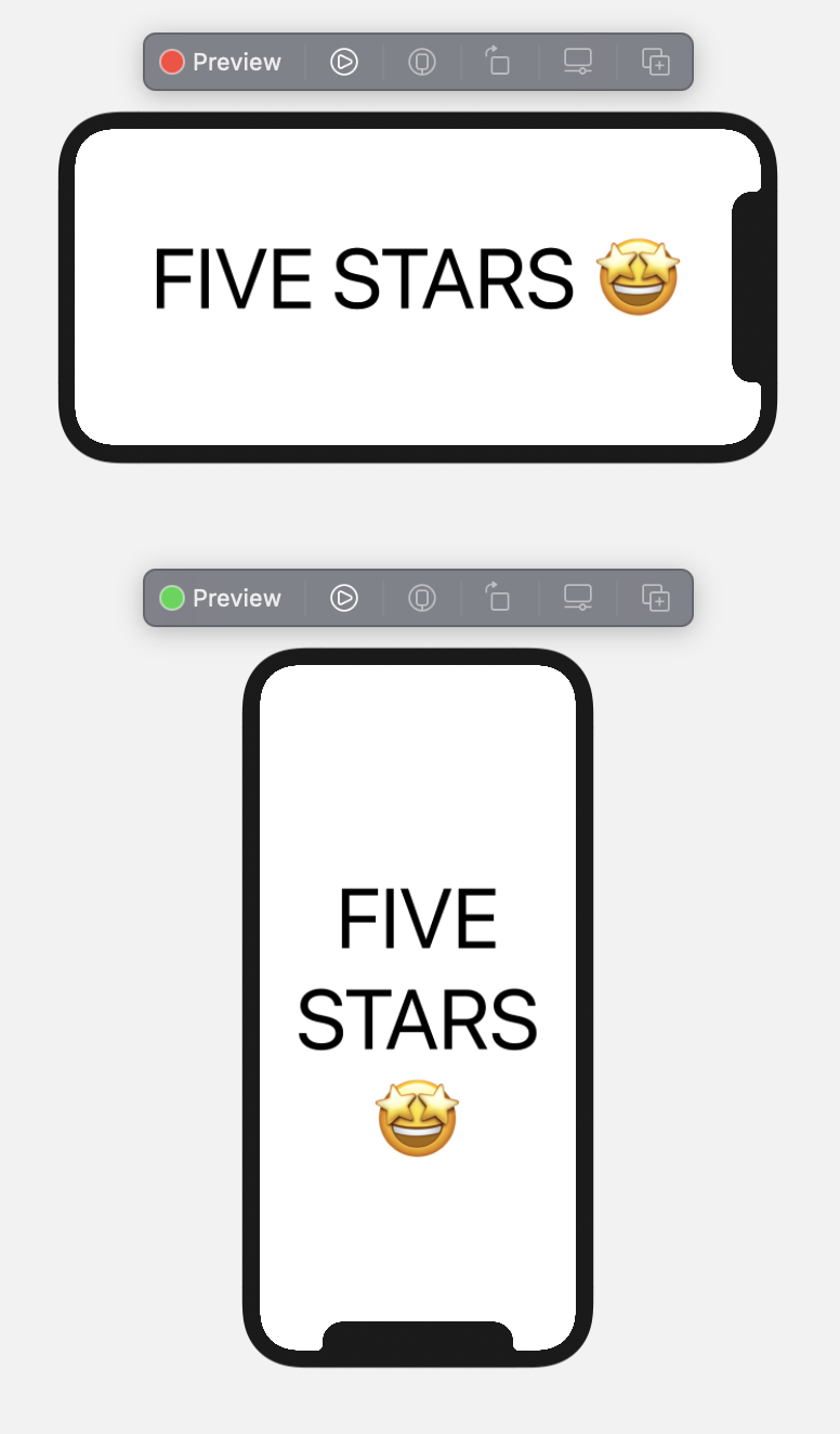
Badges
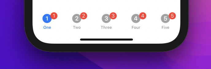
We have a new badge(_:) view modifier used to display badges on UI components:
TabView {
  Text("FIVE STARS")
    .badge(1)
    .tabItem { Label("One", systemImage: "1.circle.fill") }
  Text("FIVE STARS")
    .badge(2)
    .tabItem { Label("Two", systemImage: "2.circle.fill") }
  Text("FIVE STARS")
    .badge(3)
    .tabItem { Label("Three", systemImage: "3.circle.fill") }
  Text("FIVE STARS")
    .badge(4)
    .tabItem { Label("Four", systemImage: "4.circle.fill") }
  Text("STARS")
    .badge(5)
    .tabItem { Label("Five", systemImage: "5.circle.fill") }
}
badge(_:) accepts both numbers and strings, it's displayed when applied to TabView items and Text on Lists:
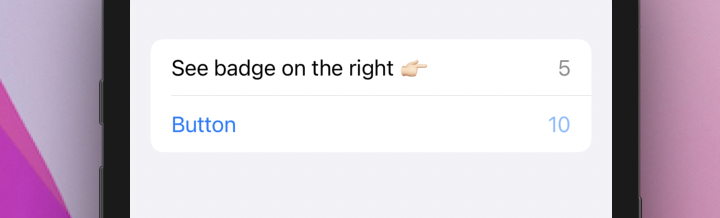
List {
  Text("See badge on the right 👉🏻")
    .badge(5)
  Button {
    // ...
  } label: {
    Text("Button")
      .badge(10)
  }
}
Property wrappers meet Optional RawRepresentable
Last year we saw the introduction of both @AppStorage and @SceneStorage, which we covered here, this year both property wrappers gained the possibility to be associated with an optional RawRepresentable type:
extension AppStorage {
  public init<R: RawRepresentable>(
    _ key: String,
    store: UserDefaults? = nil
  ) where Value == R?, R.RawValue == String

  public init<R: RawRepresentable>(
    _ key: String,
    store: UserDefaults? = nil
  ) where Value == R?, R.RawValue == Int
}

extension SceneStorage {
  public init<R: RawRepresentable>(
    _ key: String
  ) where Value == R?, R.RawValue == String

  public init<R: RawRepresentable>(
    _ key: String
  ) where Value == R?, R.RawValue == Int
}
Allowing us to start with a blank state, without forcing us to choose a default value:
enum Fruit: Int, Identifiable, CaseIterable {
  case banana
  case orange
  case mango

  var id: Int { rawValue }
}

struct ContentView: View {
  @AppStorage("fruit") private var fruit: Fruit?

  var body: some View {
    Picker("My Favorite Fruit", selection: $fruit) {
      ForEach(Fruit.allCases, id: \.self) {
        Text("\($0)" as String)
      }
    }.pickerStyle(SegmentedPickerStyle())
  }
}
In this example, the picker will have no value selected at launch.
Conclusions
This is just a sneak peek at some of the new SwiftUI changes from this year, we will explore many more during the rest of the summer:
if you haven't already, this is a great moment to subscribe to Five Stars's feed rss or follow @FiveStarsBlog on Twitter!
What are you most excited about WWDC21? Let me know!