What's new in Xcode 13.2 beta 1
 @zntfdr
Xcode 13.2 will definitively be remembered as the release that brought us Swift concurrency backward compatibility. Despite this, we have some very cool SwiftUI updates. Let's take a look!
Large Content Viewer
VStack {
  Button("Tap me") { print("Button Tapped") }
    .accessibilityShowsLargeContentViewer()

  Button("Tap me 2") { print("Button Tapped") }
    .accessibilityShowsLargeContentViewer {
      Text("A different text")
    }
}
Large Content Viewer is an accessibility feature that has been around since iOS 13.
In short, when an accessibility dynamic type size is enabled, it allows us to enlarge/highlight the UI element the user is hovering on via a system HUD.
With Xcode 13.2, we can now use it with SwiftUI as well.
Besides the two view modifiers shown in the example, SwiftUI now comes with a new accessibilityLargeContentViewerEnabled environment value, to be used in case we'd need to change some gesture behaviors to accommodate this accessibility feature.
Both view modifiers and environment value are available from iOS 15.0, macOS 12.0, tvOS 15.0, watchOS 8.0.
Documentation
While Xcode 13.2b1 doesn't bring many new SwiftUI features, we have a significant and welcome upgrade in SwiftUI's documentation.
We have new documentation for:
SectionedFetchRequestSectionedFetchResultsTextTextFieldToggleStyletoggleStyle(_:)ToggleStyleConfigurationToggleStyle.automatic- All recent
backgroundandoverlayview modifiers
Let's highlight a few important changes.
TextField's prompt vs. title
The updated TextField documentation has an entire section explaining why we have both a title/label and a prompt parameter, and the use of both:
/// Each text field style determines where and when the text field uses a prompt and label.
/// For example, a form on macOS always places the label at the leading edge of the field
/// and uses a prompt, when available, as placeholder text within the field itself. In the
/// same context on iOS, the text field uses either the prompt or label as placeholder
/// text, depending on whether the initializer provided a prompt.
(Toggle) Styles defaults and contextual defaults
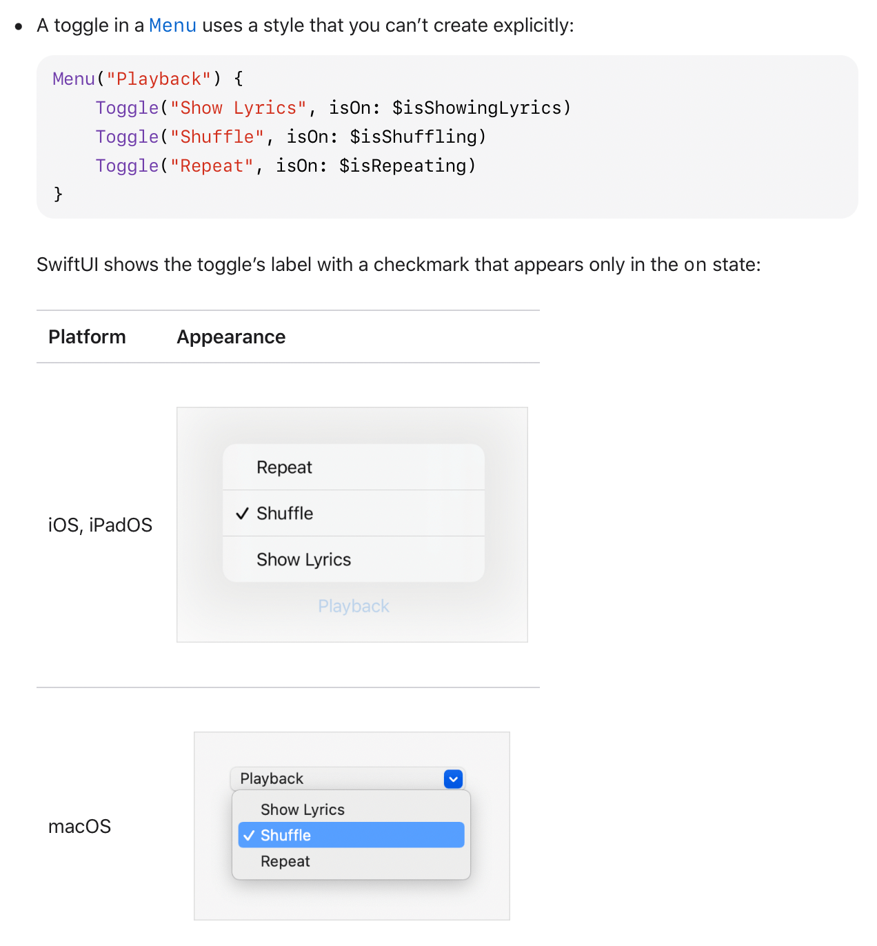
SwiftUI's styling is highly adaptive and can change widely based on the context. Until now, it was anyone's guess which style was adopted in which scenarios (and answered only via experimentation).
After this update, we no longer have to guess, as the documentation clearly states how our toggles will appear in different scenarios.
Looking forward to seeing all other styles get the same treatment.
Wording: from "primitive" to "built-in"
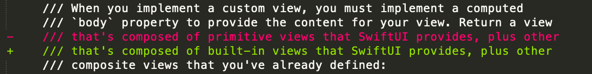
When referring to baked-in SwiftUI definitions for views, styles, commands, etc., the official wording has been "primitive".
However, the term "primitive" is not always correct, as, sometimes, even baked-in definitions are composed of other SwiftUI components. To address this, the documentation has changed the wording from "primitive" to "built-in".
Bolder soft deprecation
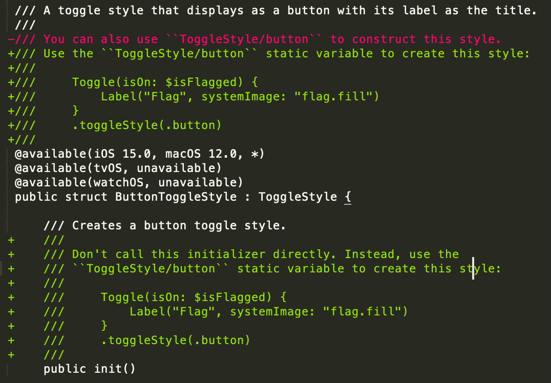
Despite SwiftUI having a clear direction on which syntax to use, most old definitions are still available and were soft deprecated with gentle messages like "You can also use X". New in Xcode 13.2, these messages are bolder and use imperative words instructing developers on what to use.
Bug fixes
From Xcode 13.2, Lists and Forms respect the safe areas insets declared via safeAreaInset(edge:content:) view modifier.
Conclusions
Did you find anything else interesting in Xcode 13.2 beta 1? Please let me know!